Hiking To and Sketching At Ice Lake

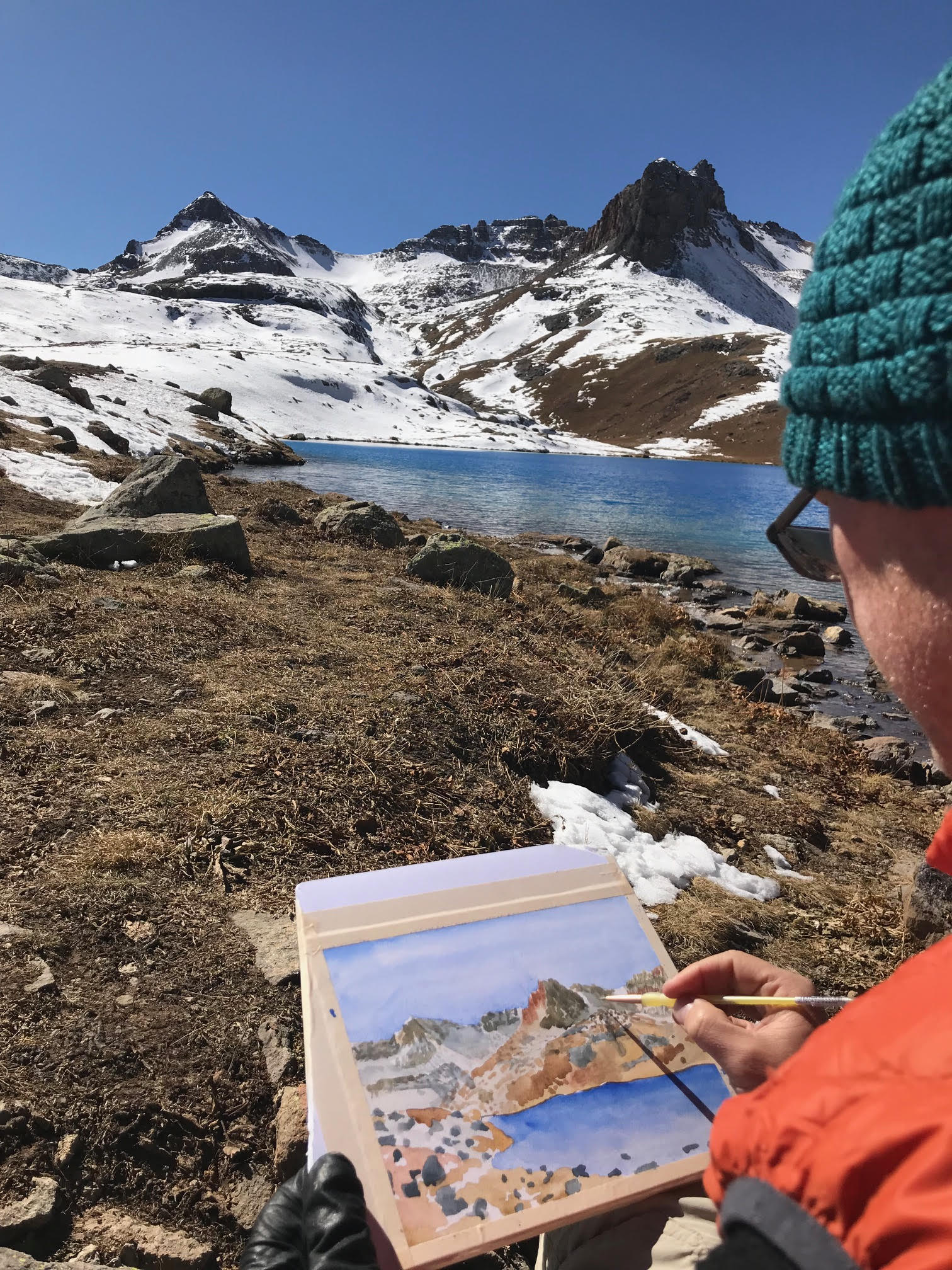
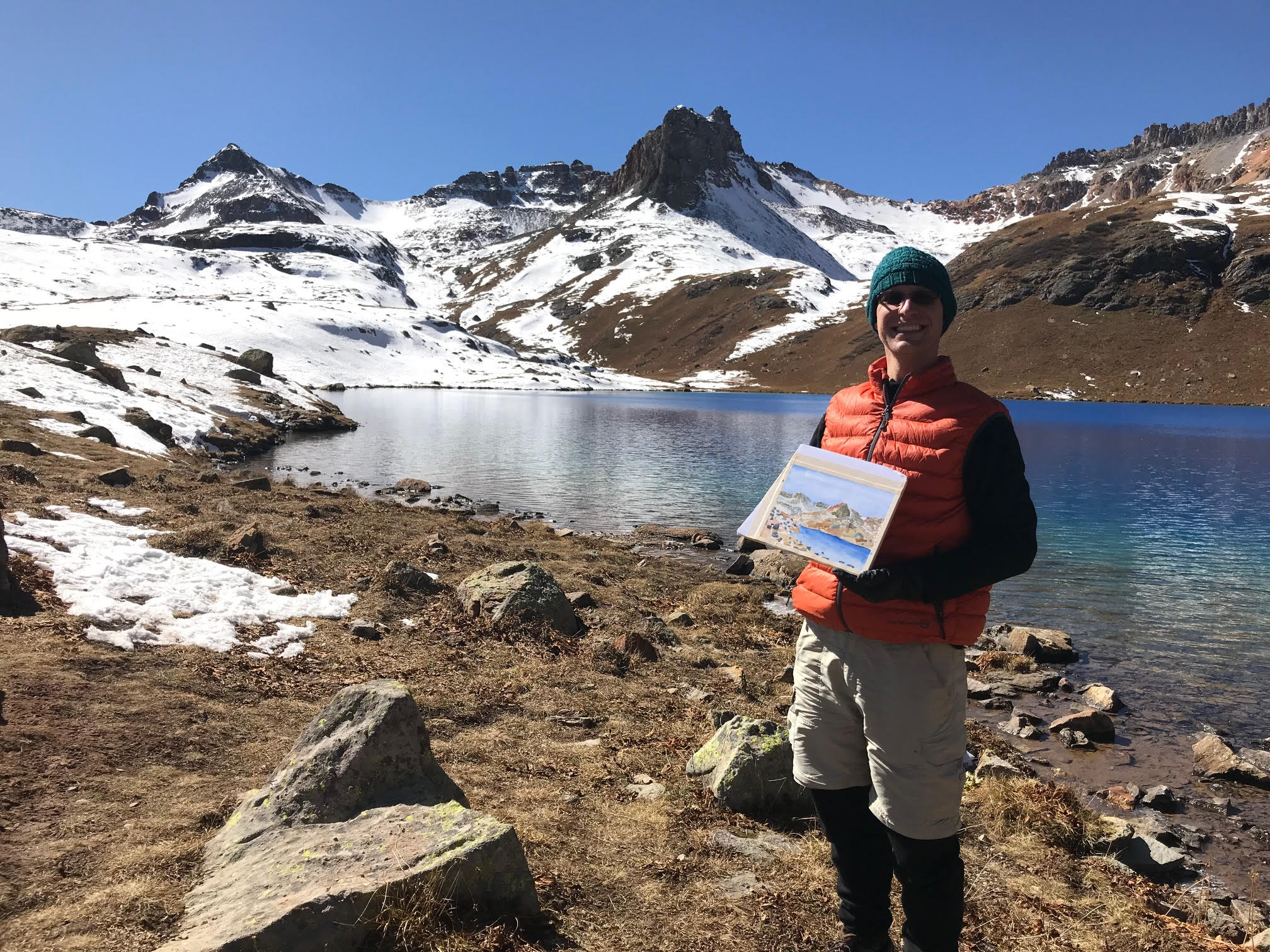
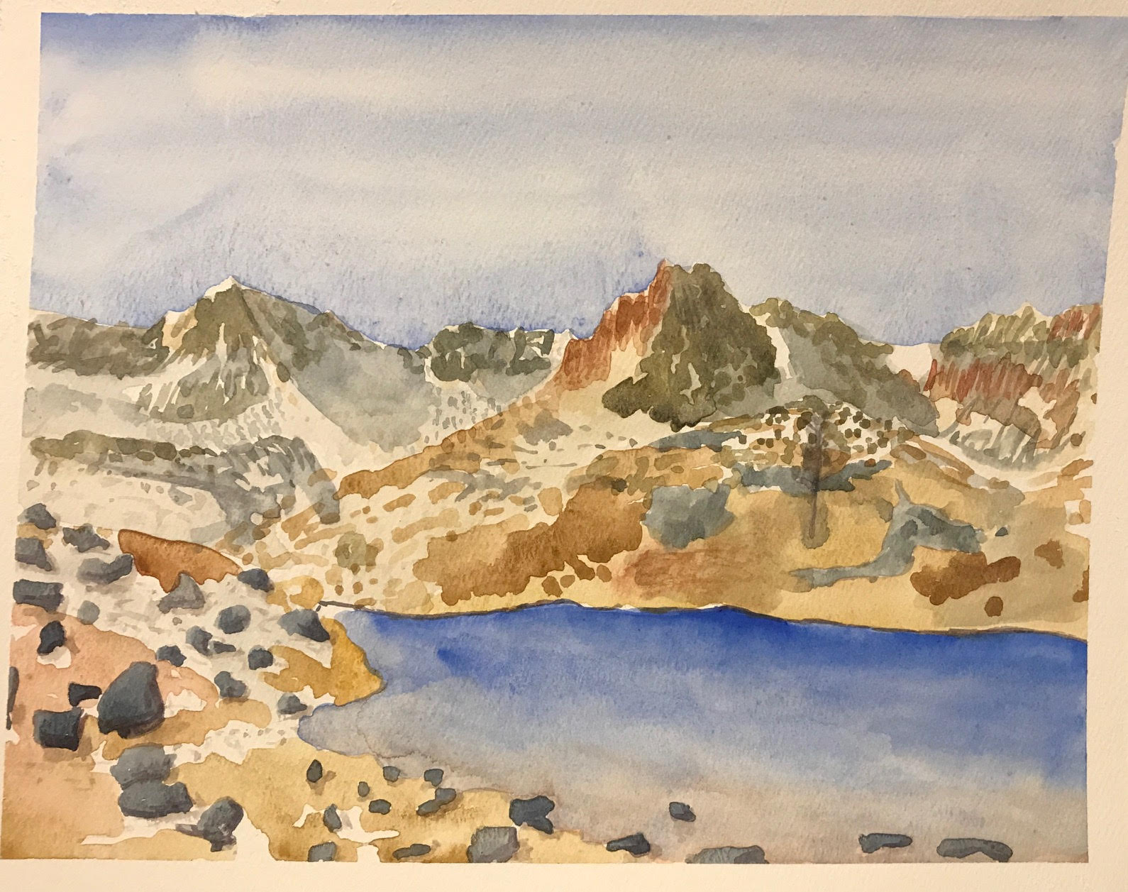
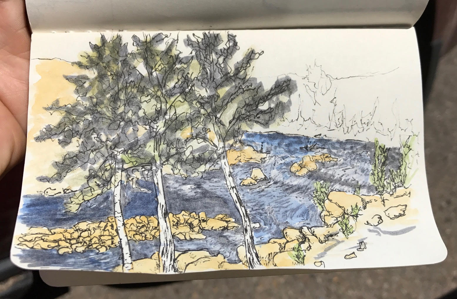
A few years ago (5?) I was told to check out Ice Lake and to take a jaunt over to the nearby Island Lake if I get up there. Well, I finally made it. Yesterday morning I headed up into the mountains for a bit of day hiking. It’s a bit of a climb, but oh-so worth it!

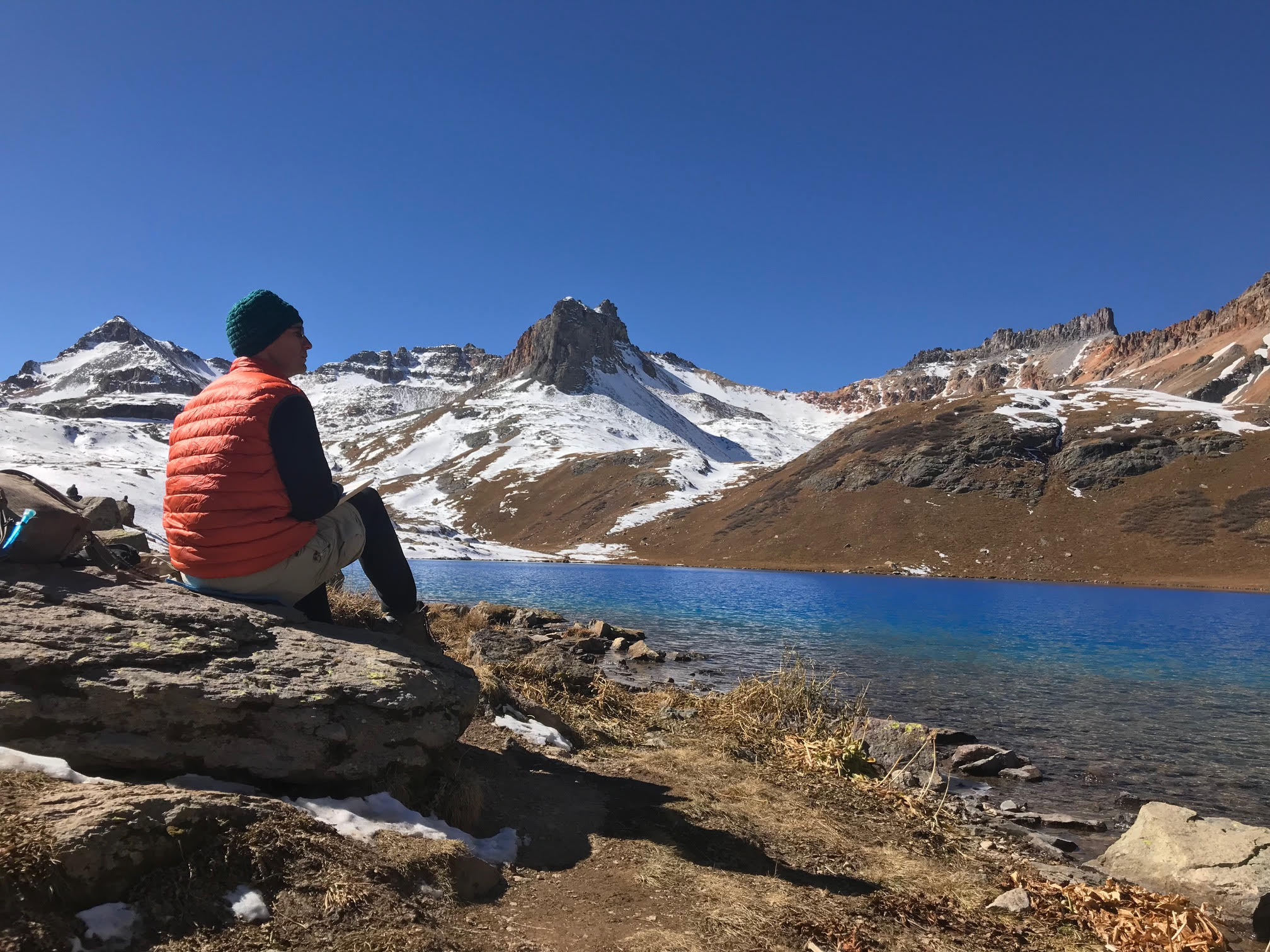
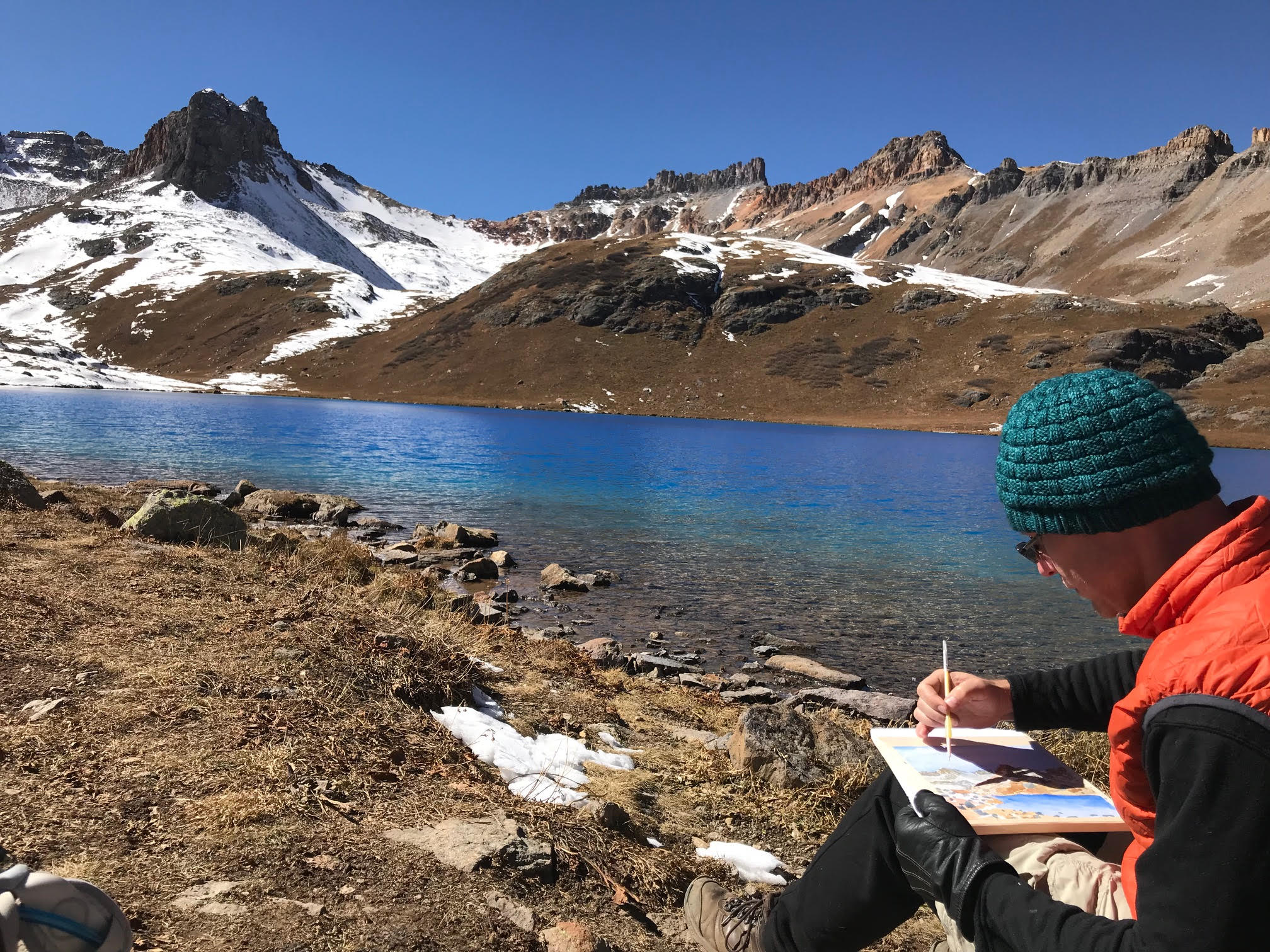
Here’s me capturing the view from my lunch spot:

It was pretty chilly and my hands get cold pretty easily, but I needed my right hand free for dexterity…

I’m pretty happy with the results. Taking more time certainly helps, and I tried some new tools (like a bigger brush and gator board for backing).

Accordion Folded Durango Sketches

I’ve really been enjoying the fall colors here in Durango, Colorado. Trying to make the most of it, I’ve been going out on my lunch break and quickly sketching scenes from around town in ink and watercolor.

Instead of carrying a pad of paper with me I followed Mark’s advice for making a sketchbook with me, a single piece of watercolor paper cut and folded into a long, accordion notebook. Here’s my current journal, all laid out:
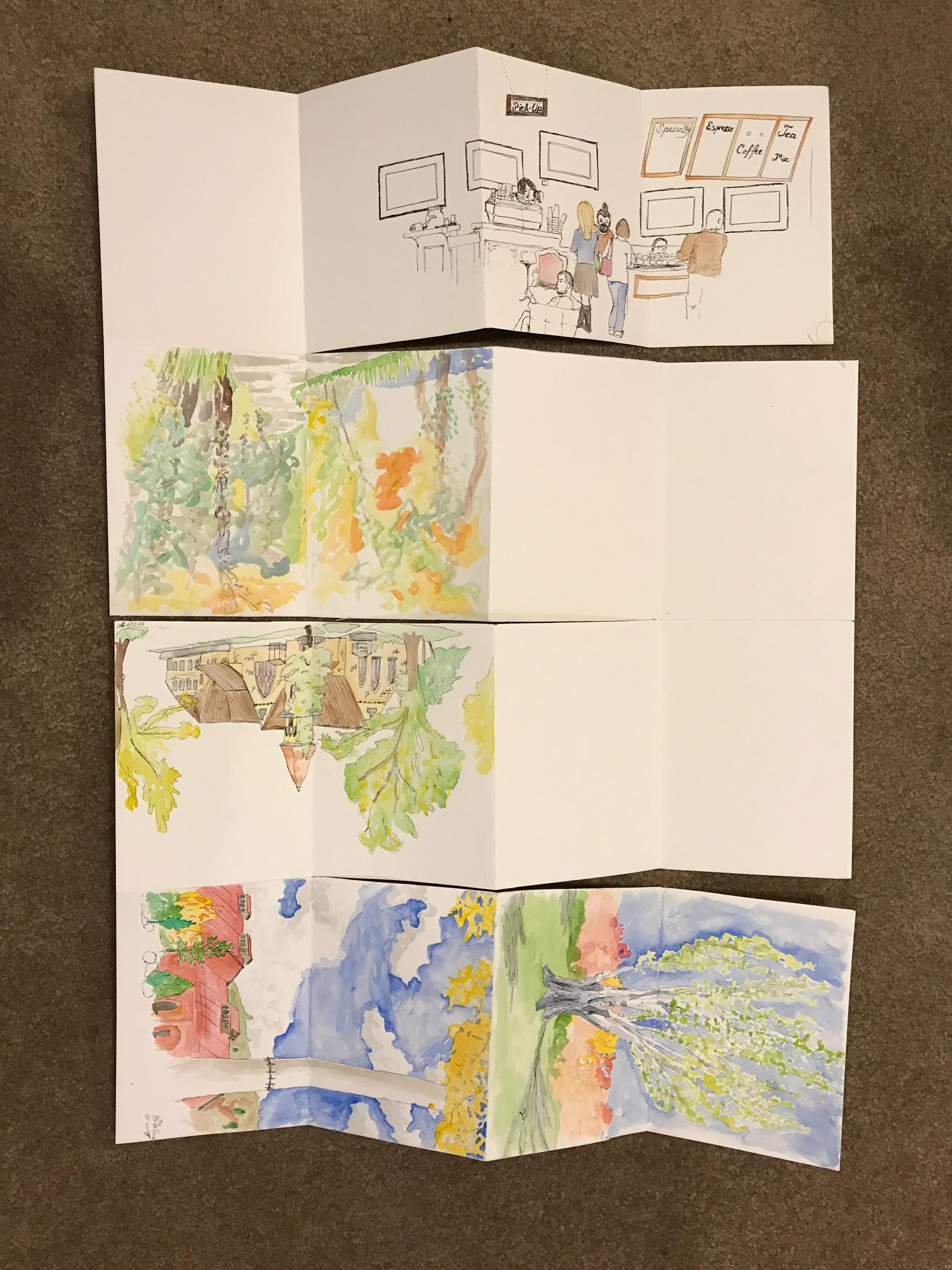
It’s been nice to have a good-quality, heavy watercolor paper in my sketchbook. This has allowed me to really throw down a lot of water quickly – an important ability when I have no more than 30 minutes to get everything finished.

I’ve taken these opportunities to work on both my sketching abilities and to play with the watercolors, something that I’ve always been a little timid with.
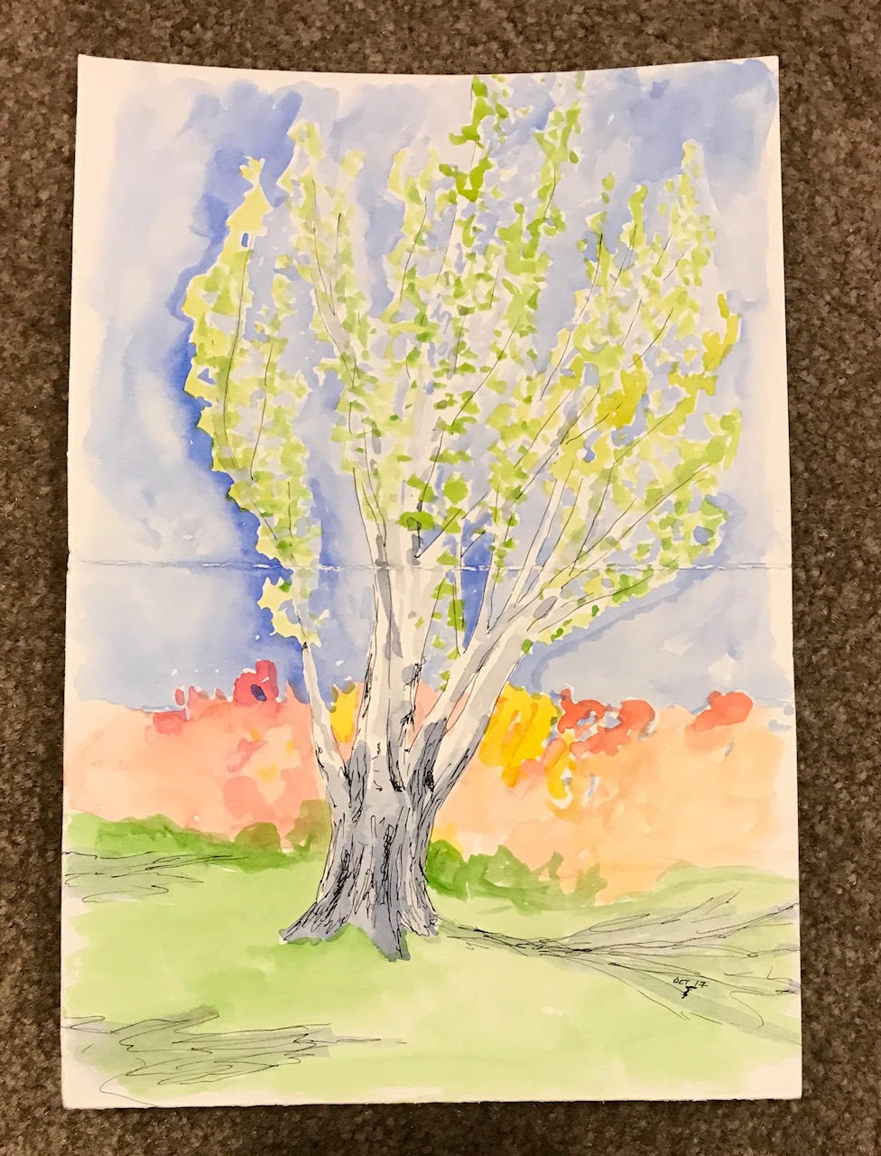
This tree caught my attention the first time I saw it, and it was an easy decision to portray it when I first started sketching. It’s a tall tree and I probably should have unfolded another “page” to capture it more accurately, but I love the colors!
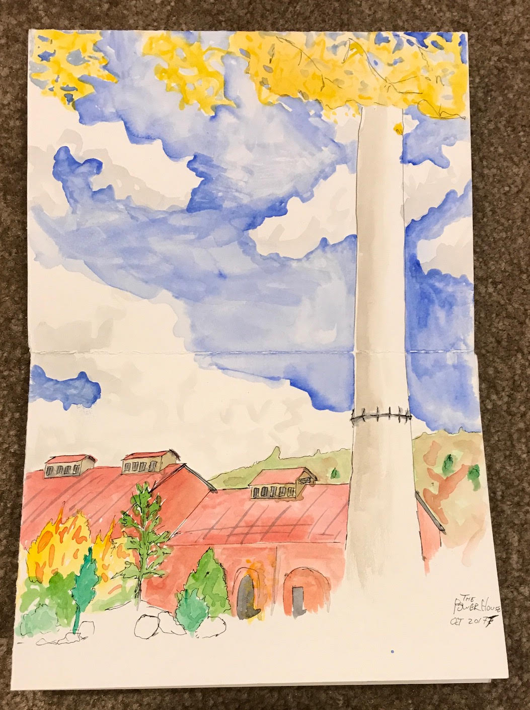
This old powerhouse is now a science museum. I haven’t been inside, yet, but it’s definitely on the list of places to visit!
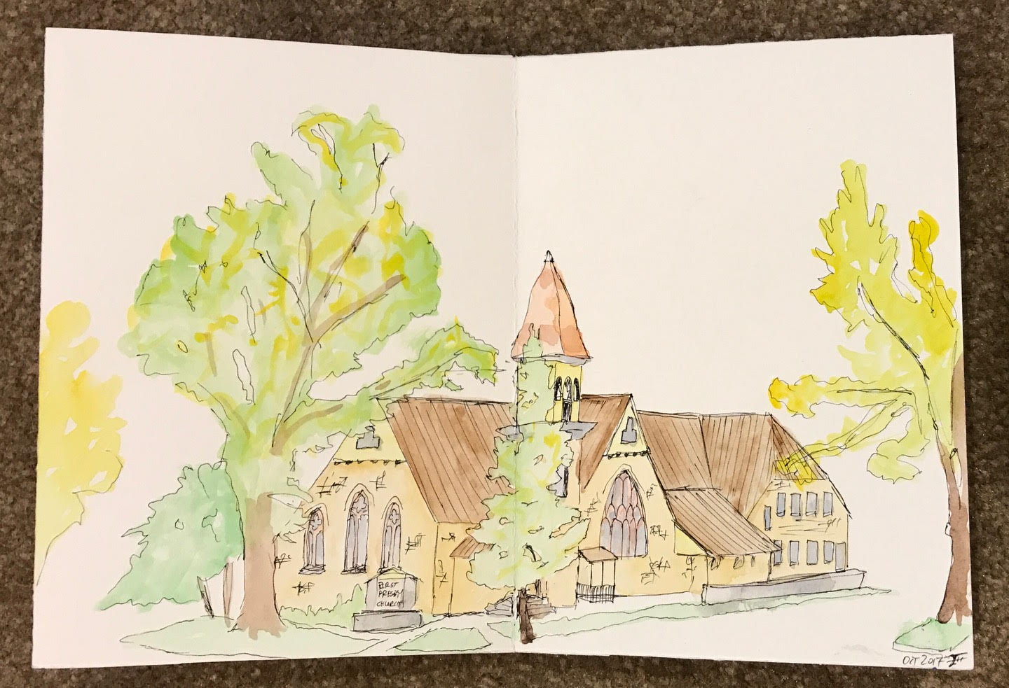
This church is just on the the other side of the block from one of my favorite coffee shops, so I see it all the time. The architecture jumped out at me and when deciding where to sketch it quickly came to mind as a great option. I sat across the street on a bench to capture it.
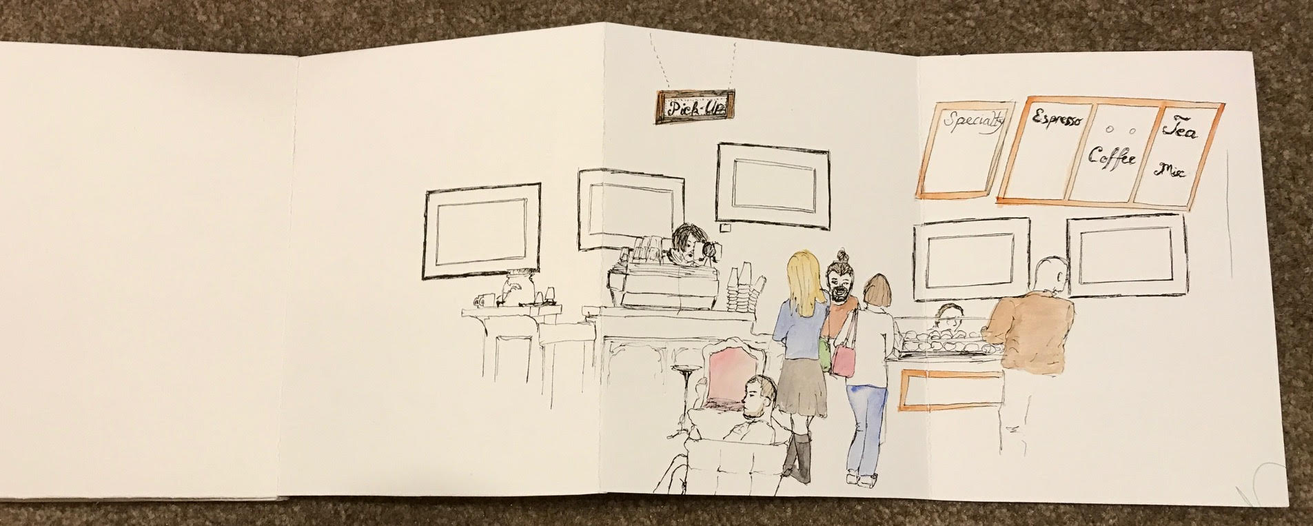
I was aiming for a nearby section of trail but the spitting rain drove me inside. I snagged the last seat in Durango Coffee and sipped my java while drawing the bar and patrons at this downtown cafe. It was a lot of fun to have the extra space afforded by the additional panels, and I expect to return and fill in the other “page” on another day.
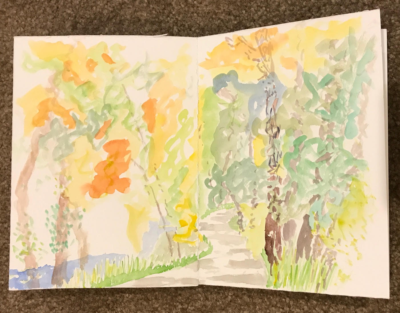
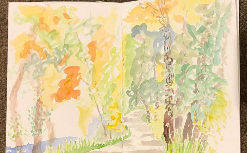
Here’s the river trail that I was aiming for when I ended up at Durango Coffee above. This view of the path through the trees beside the river came out much more abstract that intended, but I really like the deviation from my normal, detail-oriented approach!
Bluffs over Durango

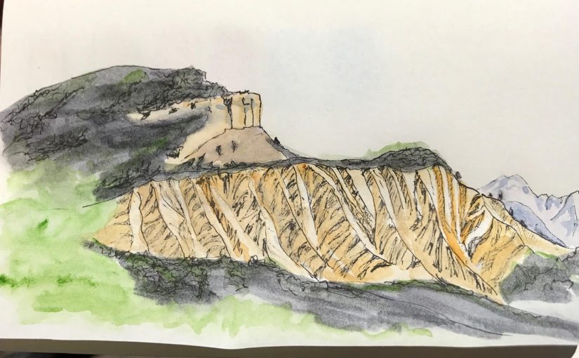
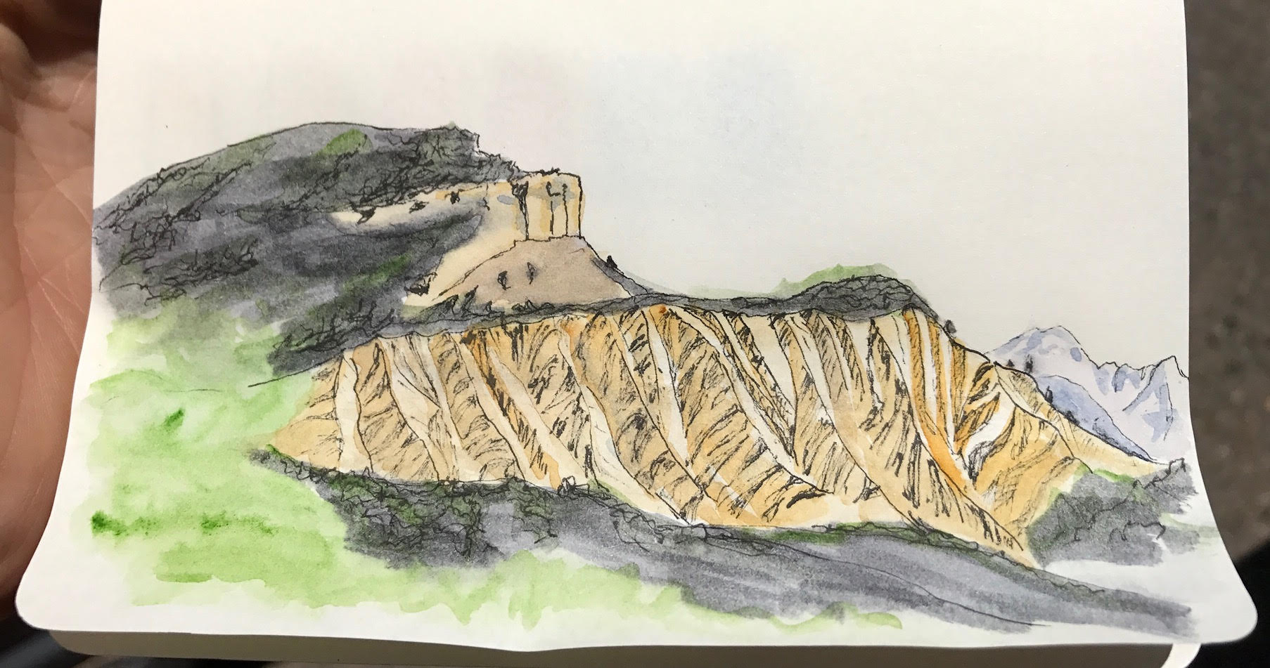
Durango sits in a valley, created by the Animas River. So there are magnificent views of the mountains from almost every point in town. This particular view is part of my morning commute into town. I love how the shadows show off the definition of the ridges – but it has to be the right time of day. In the afternoon, everything is flooded by sunlight and is flattened out.

For this morning’s sketch, I sat in the park just a few feet further upstream from the rafting sketches.

An Afternoon at the Animas River

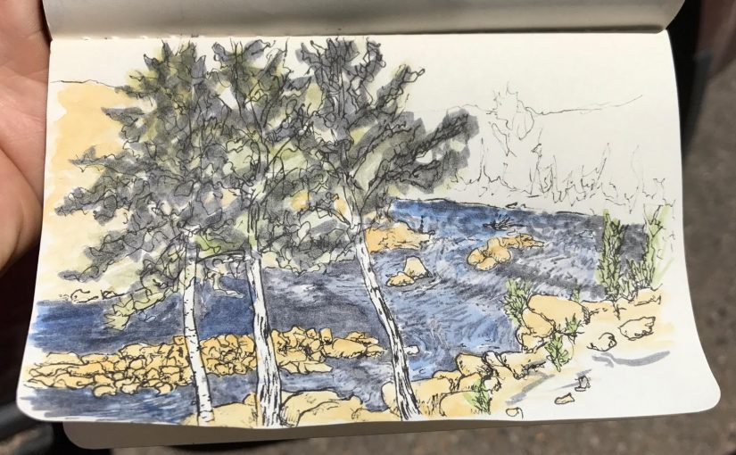
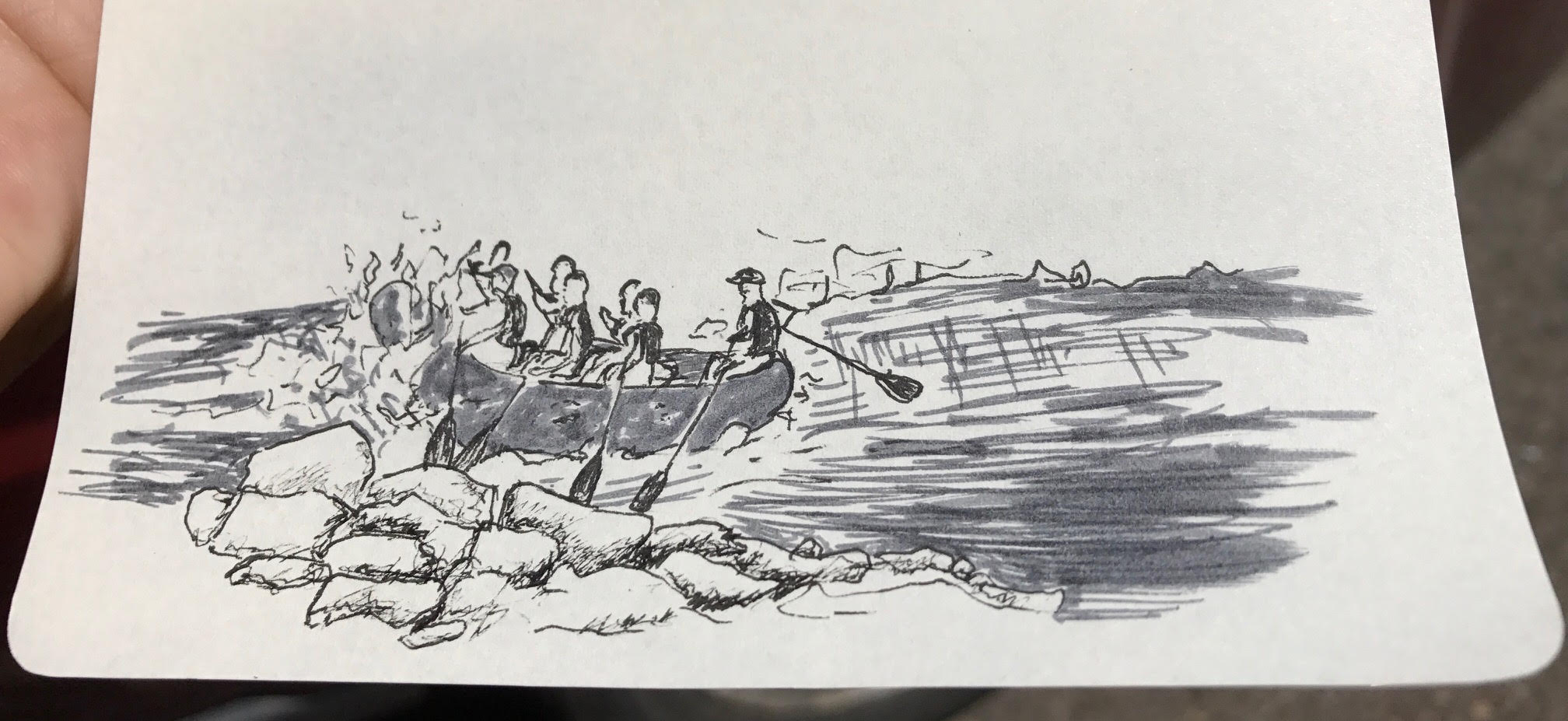
Further down the Animas River from the bridge is a series of rapids that rafters and kayakers love to play in. I took an afternoon break and enjoyed a late lunch before sketching the beginning of the rapids. These are easily accessible from one of the many parks in town.

Trying to get better with my watercolors, so I experimented with adding some color to the sketch.

Of course, since I didn’t have to leave just yet, I didn’t. While sitting a few different rafts came down. I thought they’d be a fun challenge to capture in sketch.

Which Witch?

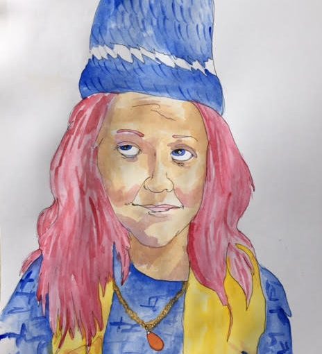
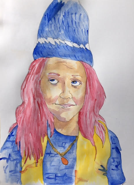
I’ve been having fun playing with my watercolors, and decided to try a new type of project. While I have a comfortable grasp on drawing portraits, I haven’t spent much time adding color to them.

While my sis-n-law was visiting and trying on a hat that I crocheted, I snapped a quick photo of her. Currently in the middle of re-reading the Harry Potter books, it occurred to me that the image would make a great illustration of a witch.

I quickly sketched her out and added some color to the sketch. Definitely not my best drawing, but as a proof-of-concept for a new-ish style and the addition of color, it worked fairly well.

After years of practice capturing every detail and trying to draw realistic images, I am trying to develop a looser, sketchy style. I love the zig-zags in the hat and the wrinkles in the bottom right corner of the shirts, so I’m making progress.

A fun experiment, one well worth repeating.

Playing with Paint

Most of my time is spent sketching or drawing. I don’t consider myself a painter, but I certainly like the idea! The idea of having the whole world of colors to play with is intoxicating.

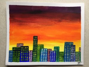
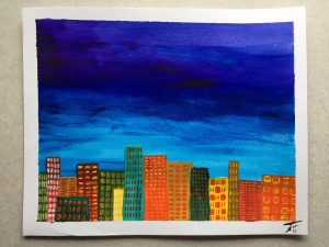
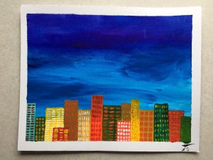
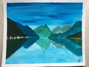
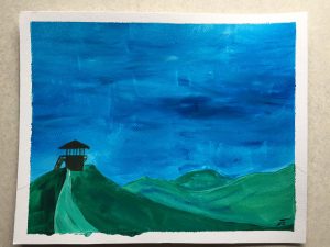
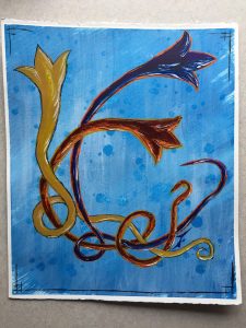
Here are a few paintings that I’ve created over the past couple of years. Each of them are painted on 8×10″ cold-rolled watercolor paper with acrylic paints. All but the abstract boxes and landscapes are subjects or concepts that I’ve been repeating (exploring in depth) throughout much of my artistic life.

(Click on the title for more details about each of the paintings/series.)

Each of these is painted on 8×10″ cold-rolled watercolor paper with acrylic paints.

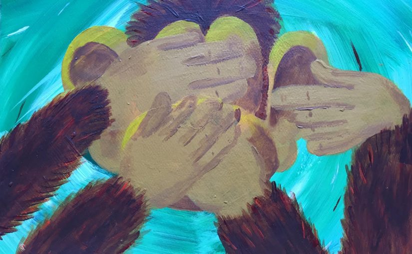
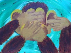
Hear, See, Speak no Evil

While enjoying a cabin in the California mountains, I decided to monkey around with some paints. The Hear/See/Speak concept is a concept that continues to capture my attention (like the triptych featuring Ashley). This was a fun painting to work on and was a good way to ease back into acrylics, since I hadn’t used them in some time prior to this.

The colors don’t look right in the image – it’s an emerald green background and a yellowish-brown fur and face.

Hear, See, Speak no Evil  is painted on 8×10″ cold-rolled watercolor paper with acrylics. It was completed in 2015.

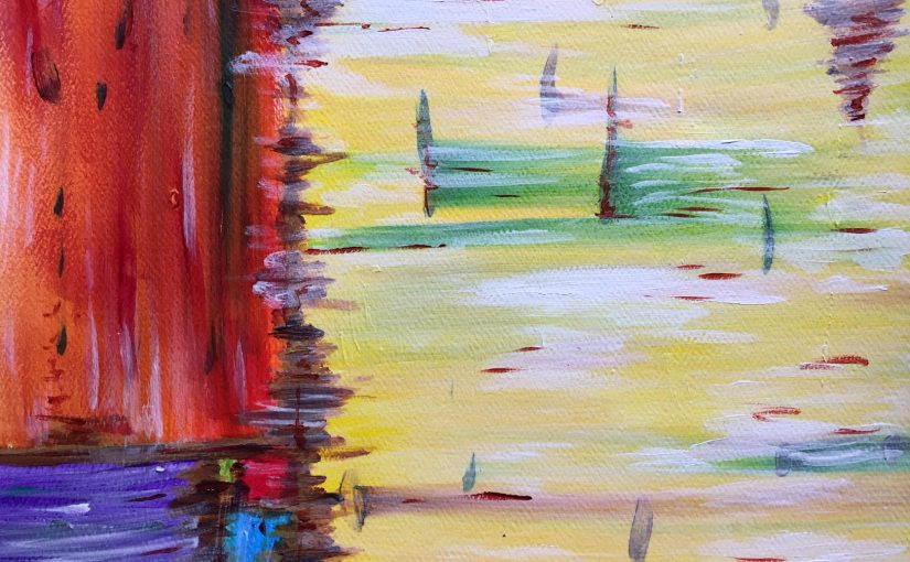
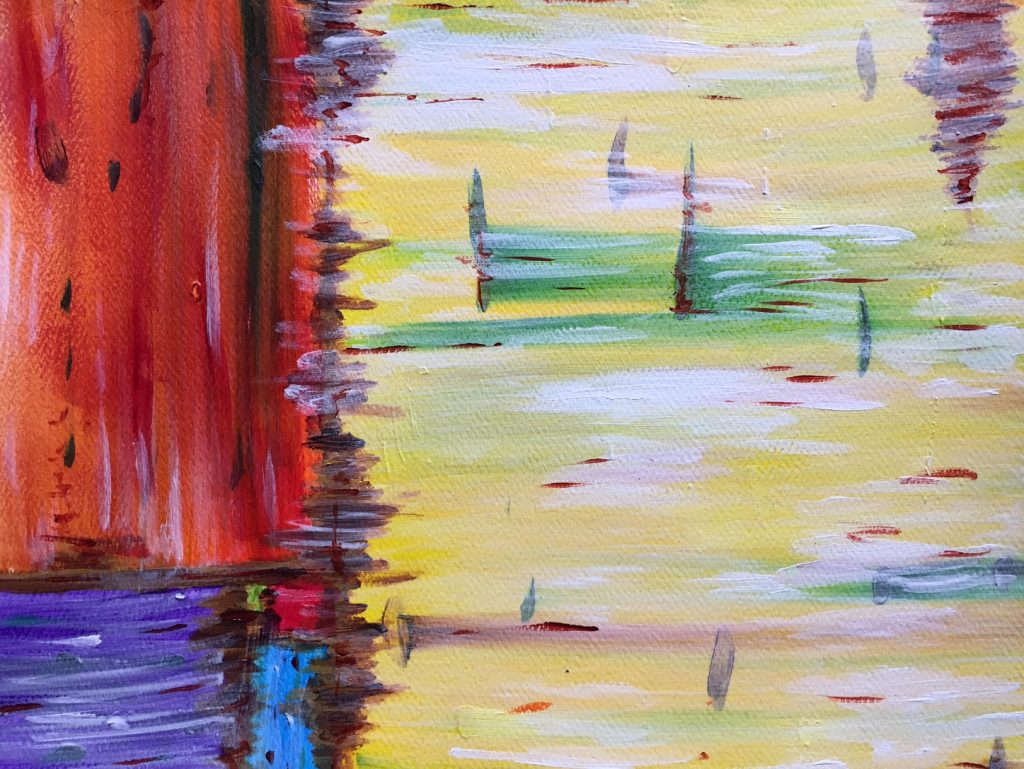
Abstract Boxes

There is some abstract art that really captures my attention, that intrigues me and draws me in. Most of it, however, I just don’t understand. Maybe that’s the analytic side of my brain coming out, or a lack in my artistic education, or… -shrugs- Whatever the reason, I generally prefer representational art, and that is definitely what I make most often.

In an attempt to further my understanding, sometimes I try my hand(s) at making abstract work. Abstract Boxes is such a piece, playing with the golden ratio and a variety of colors.

It is painted on 8×10″ cold-rolled watercolor paper with acrylics.

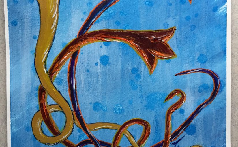
Flying Birds

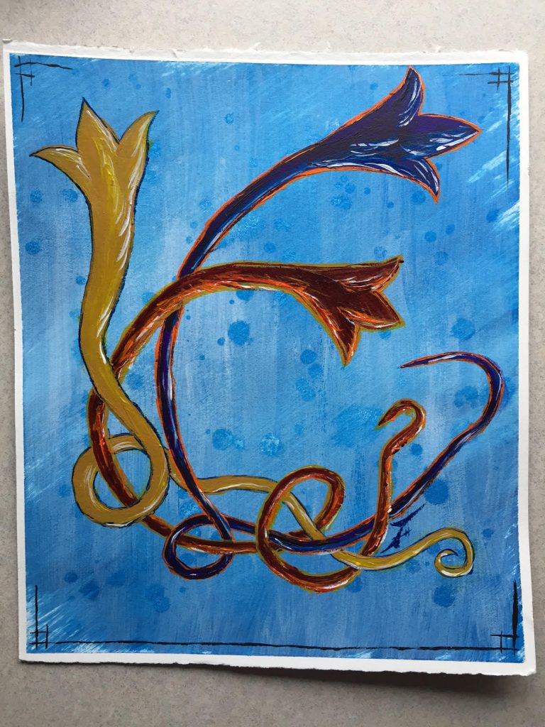
This is yet another of the recurring images that I draw, a series of (generally 3) stylized birds flying up from the left. Their tails, like ghosts, Chinese dragons, or visual after-images, show the paths they’ve traveled to arrive.

For a long time I’ve thought that this might make an interesting letterhead, or a water-marked set of stationery, though I haven’t pursued that concept yet.

Flying birds in color, with an experimental background and a version of my usual corner-framing. It’s painted on 8×10″ cold-rolled watercolor paper with acrylics.

Sunset Trees

I suppose they could be Sunrise Trees, if you prefer that time of day!

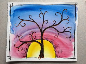
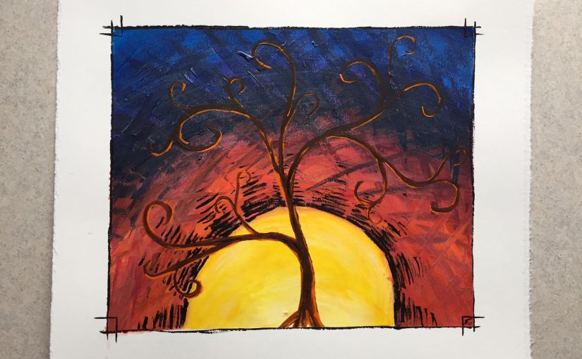
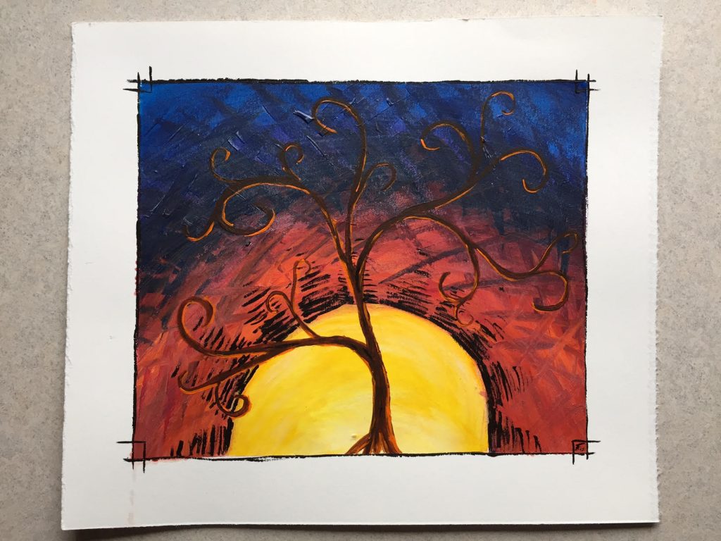
Another of the subjects that I draw regularly are trees, specifically in front of sunset. Here are a few paintings in that vein from a bit of colorful playtime.

The first two combine a few recurring subjects – the borders (specifically the corners), the trees in front of the sun, and that specific way of drawing a sun with the lined “rays” radiating out from them. Of course, I normally do all of these things in a drawing – so this is the colored version of that concept. Additionally, the rounded branches was a new style that I was playing with.

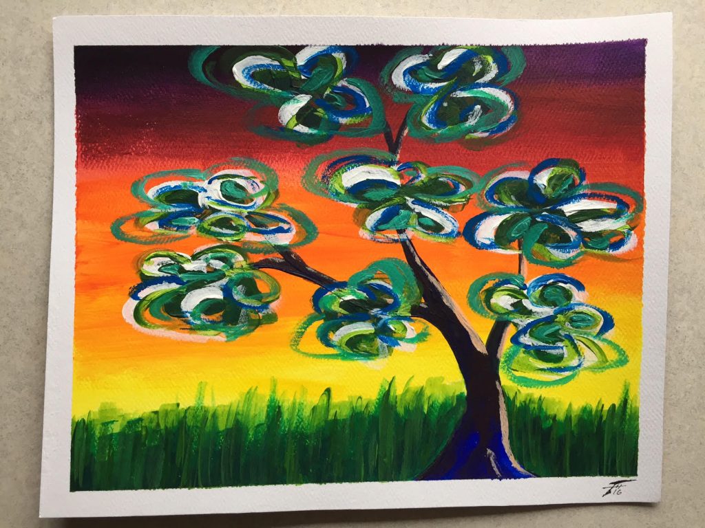
In the above I was playing with texture, using angular hatched lines to fill in the background. And while both of these are acrylic paintings, below I was experimenting with the medium, pursuing a looser, more watercolor-like feel. Along with that looseness I also varied the borders – not sure which I like more, but the varying widths certainly give drastically different feelings to the paintings!Finally, this unique tree was painted at the same time as the orange-skied cityscape and was yet another experiment. I find the delicate, bare branches of trees beautiful and fascinating as they are silhouetted by the sky – and that’s generally how I portray them. Adding leaves is relatively rare, and these stylized, swirls of foliage was an experiment in color and style.

Each of these is painted on 8×10″ cold-rolled watercolor paper with acrylic paints.