I suppose they could be Sunrise Trees, if you prefer that time of day!
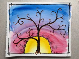
Another of the subjects that I draw regularly are trees, specifically in front of sunset. Here are a few paintings in that vein from a bit of colorful playtime.
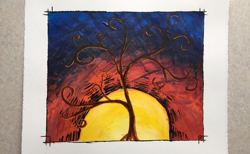
The first two combine a few recurring subjects – the borders (specifically the corners), the trees in front of the sun, and that specific way of drawing a sun with the lined “rays” radiating out from them. Of course, I normally do all of these things in a drawing – so this is the colored version of that concept. Additionally, the rounded branches was a new style that I was playing with.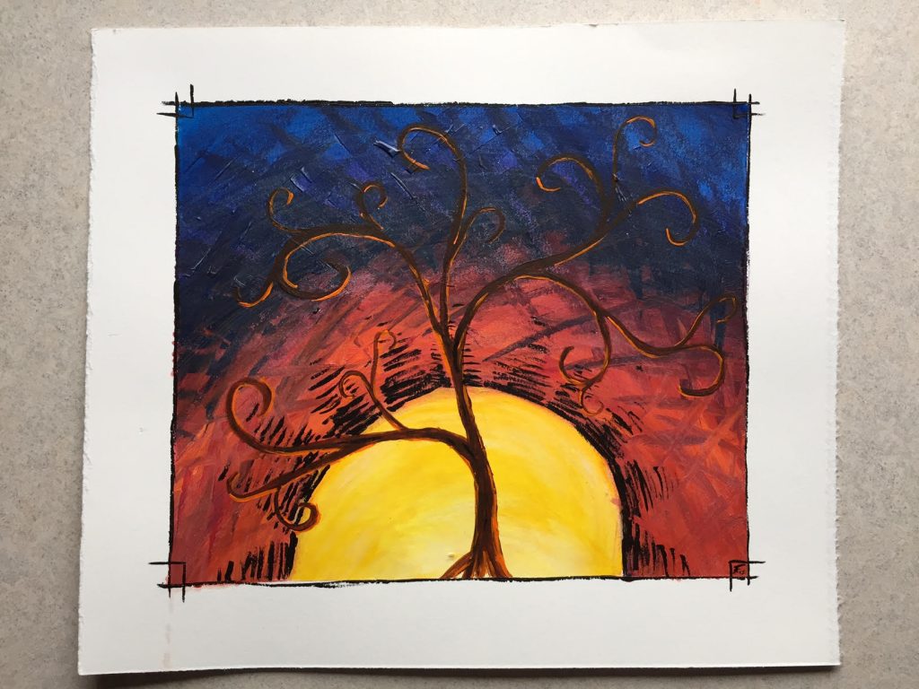
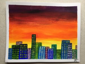
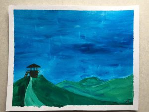
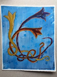
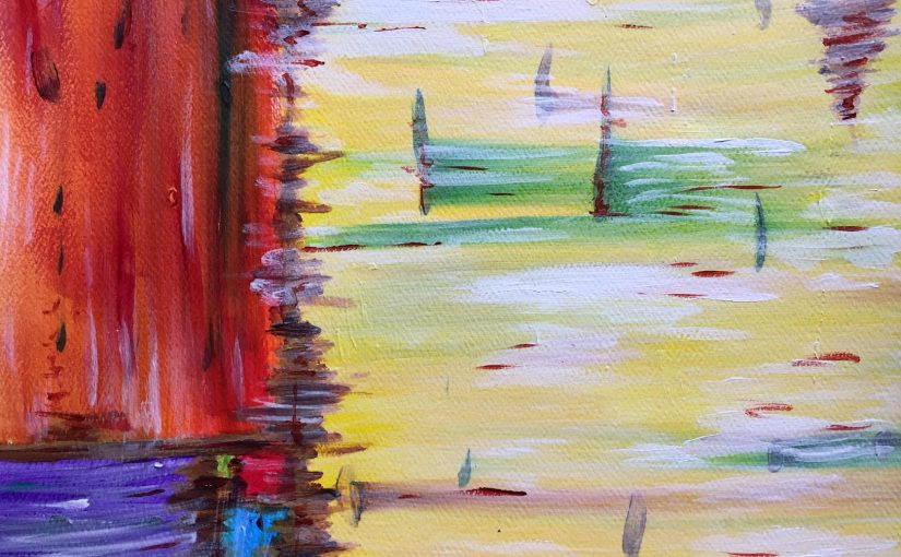
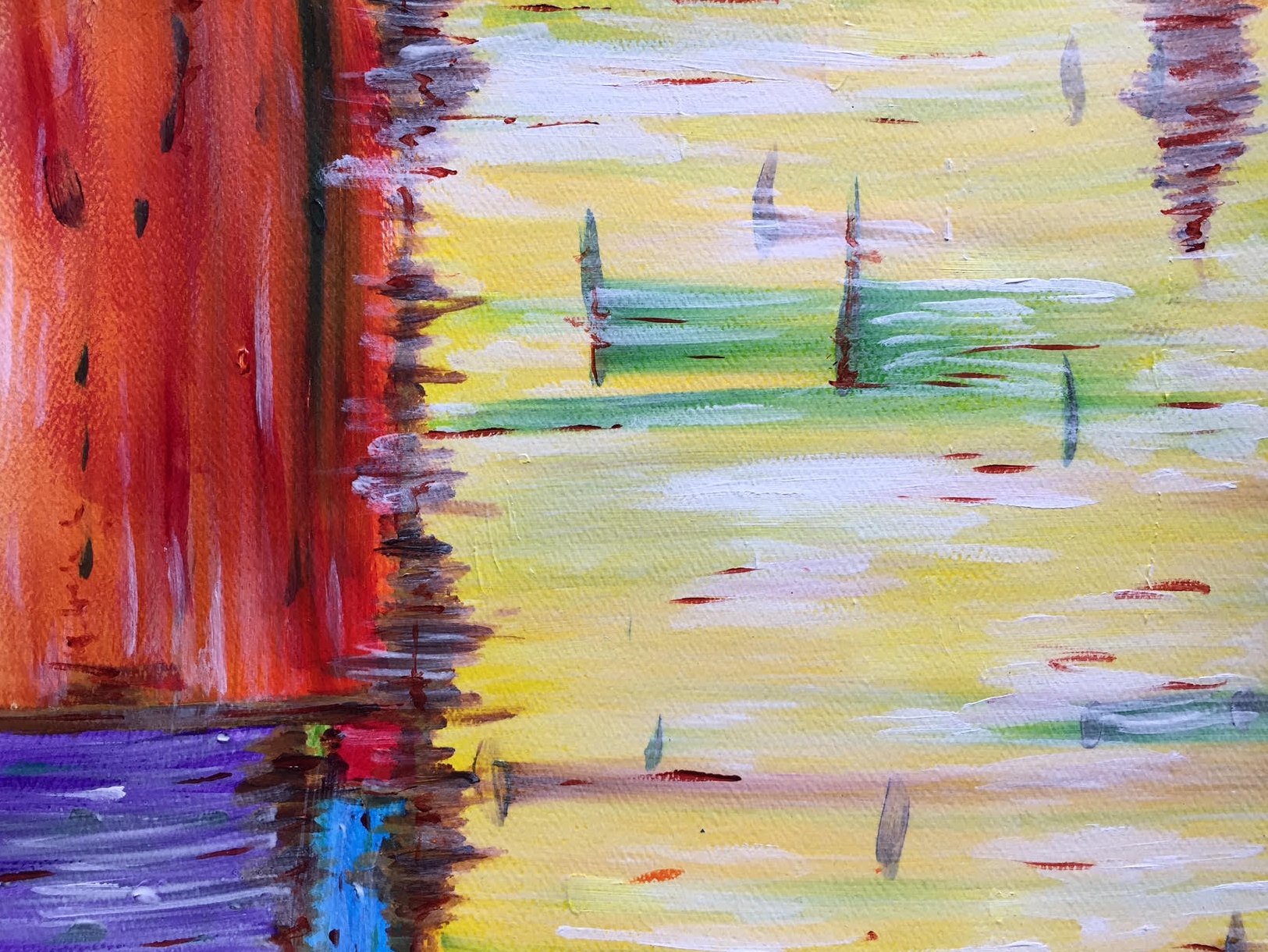
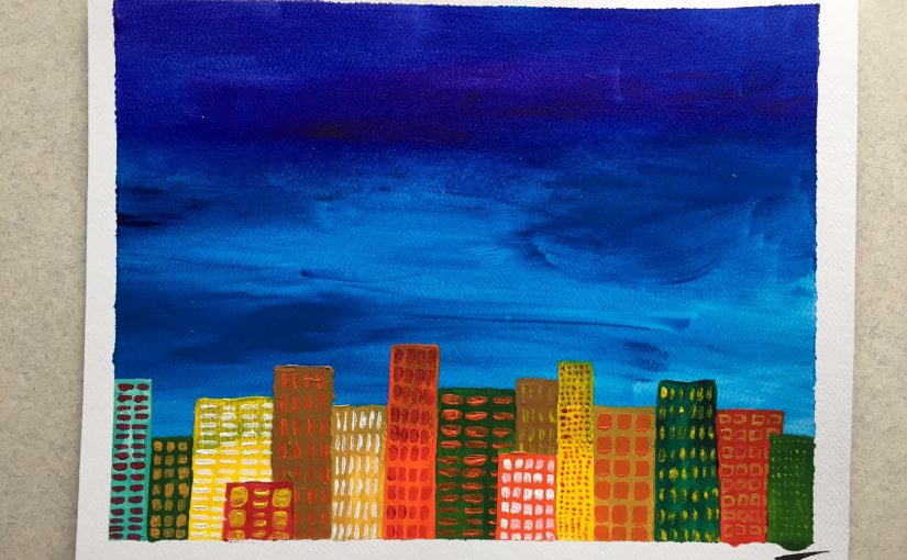
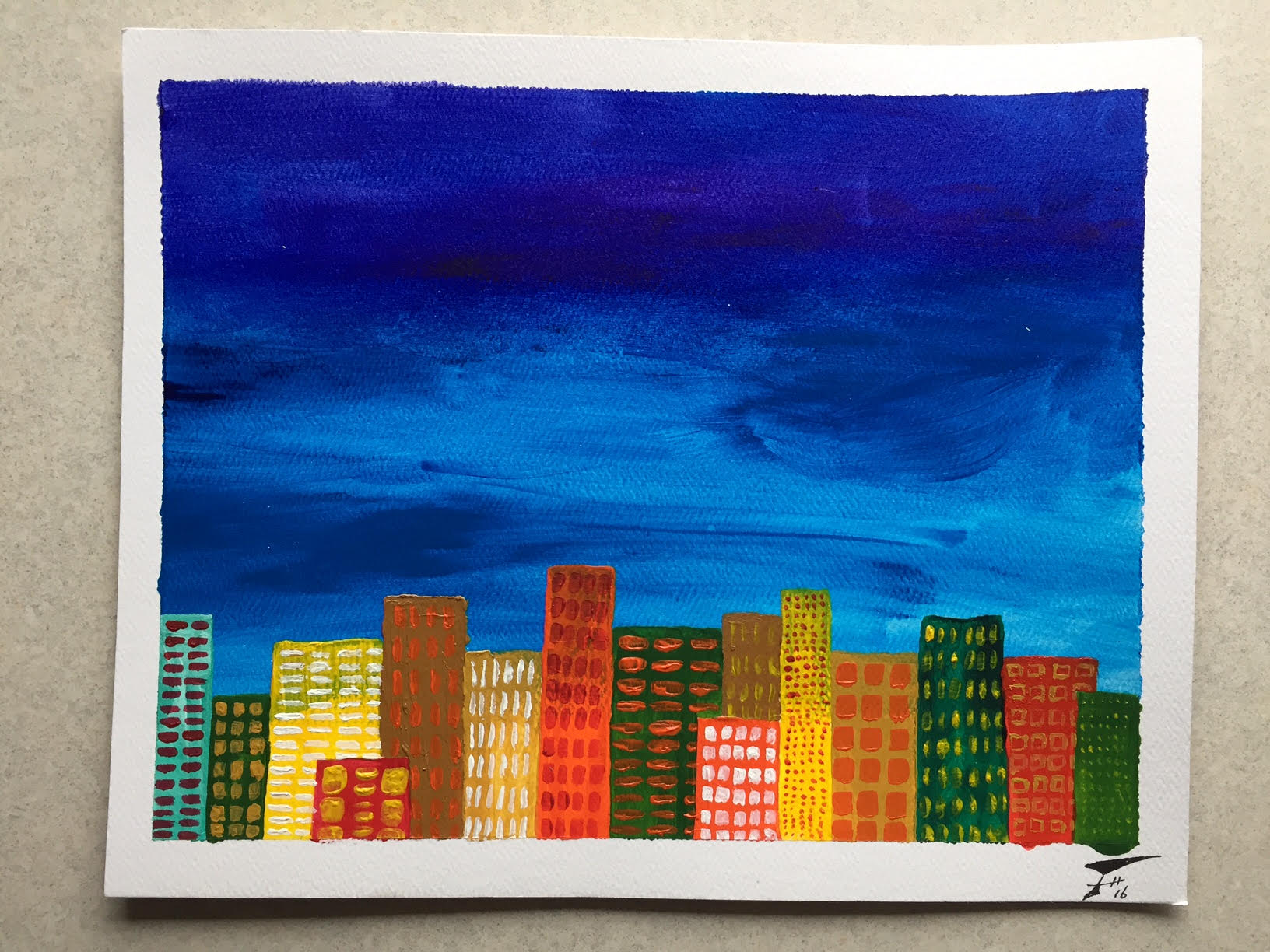
In the above I was playing with texture, using angular hatched lines to fill in the background. And while both of these are acrylic paintings, below I was experimenting with the medium, pursuing a looser, more watercolor-like feel. Along with that looseness I also varied the borders – not sure which I like more, but the varying widths certainly give drastically different feelings to the paintings! Finally, this unique tree was painted at the same time as the orange-skied cityscape and was yet another experiment. I find the delicate, bare branches of trees beautiful and fascinating as they are silhouetted by the sky – and that’s generally how I portray them. Adding leaves is relatively rare, and these stylized, swirls of foliage was an experiment in color and style.
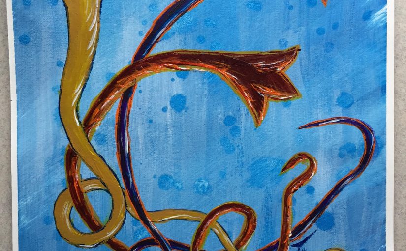
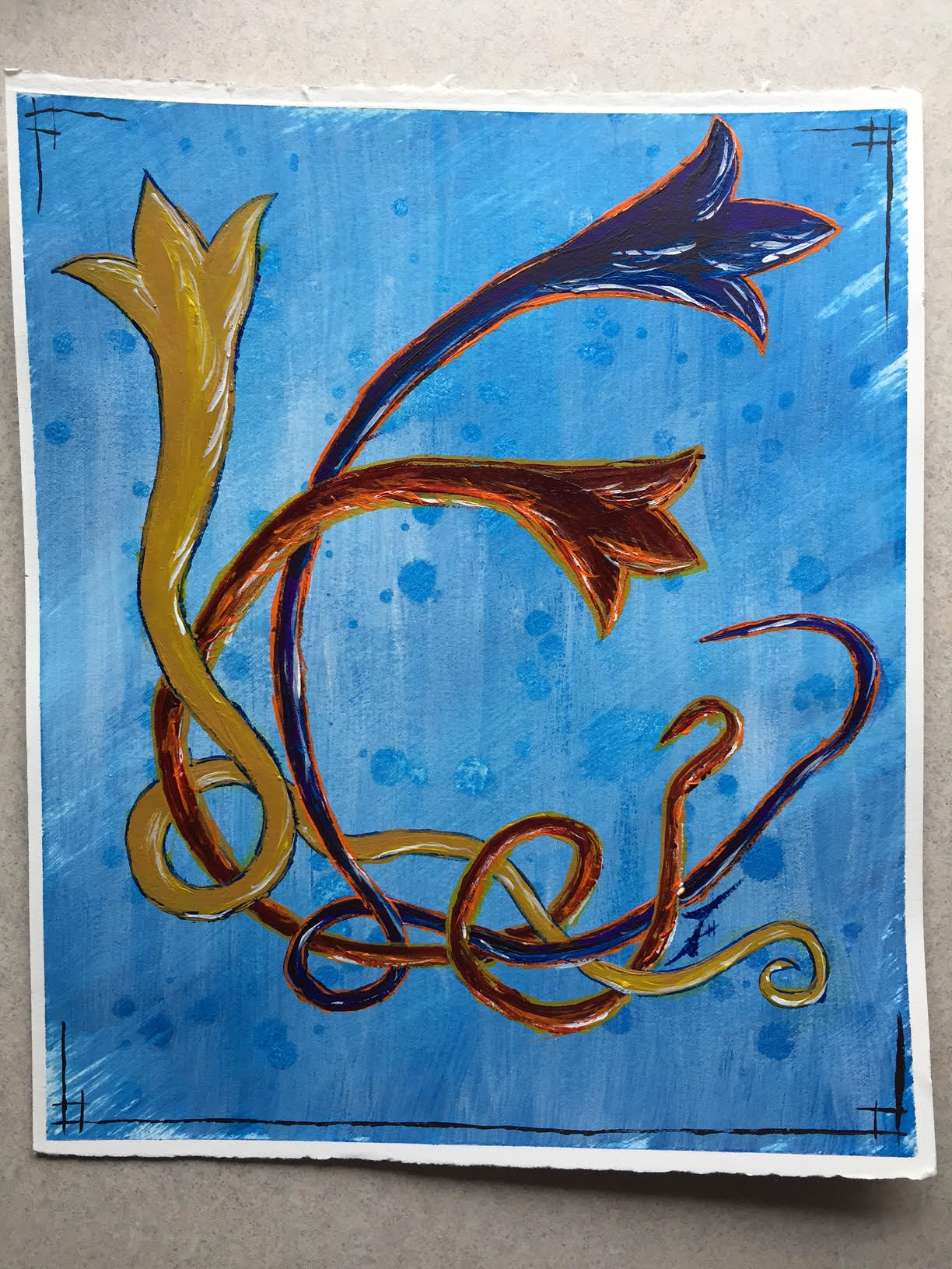
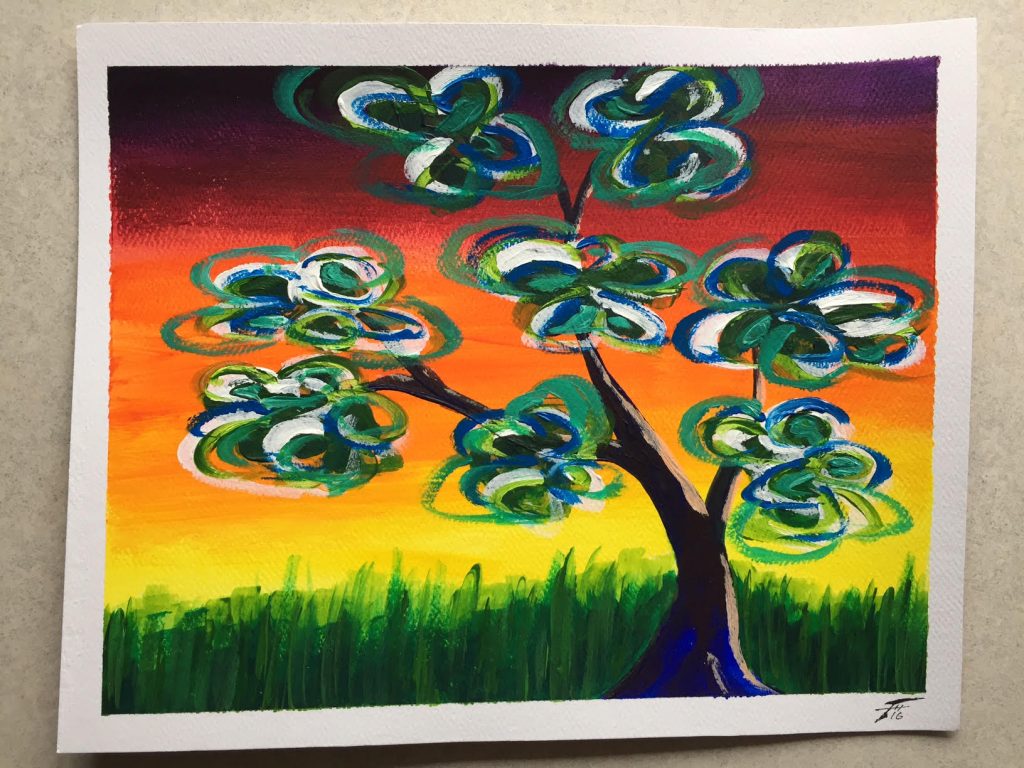
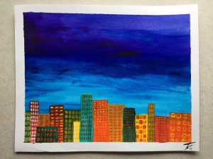
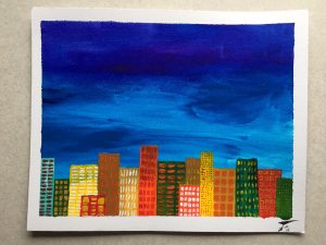
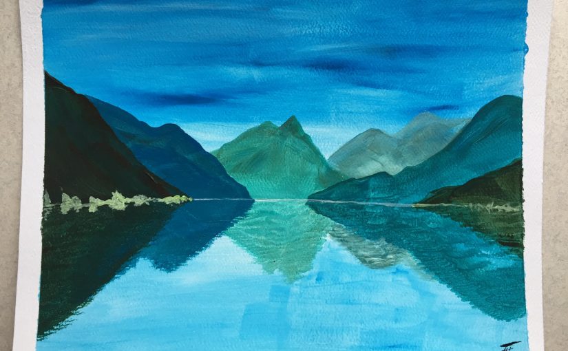
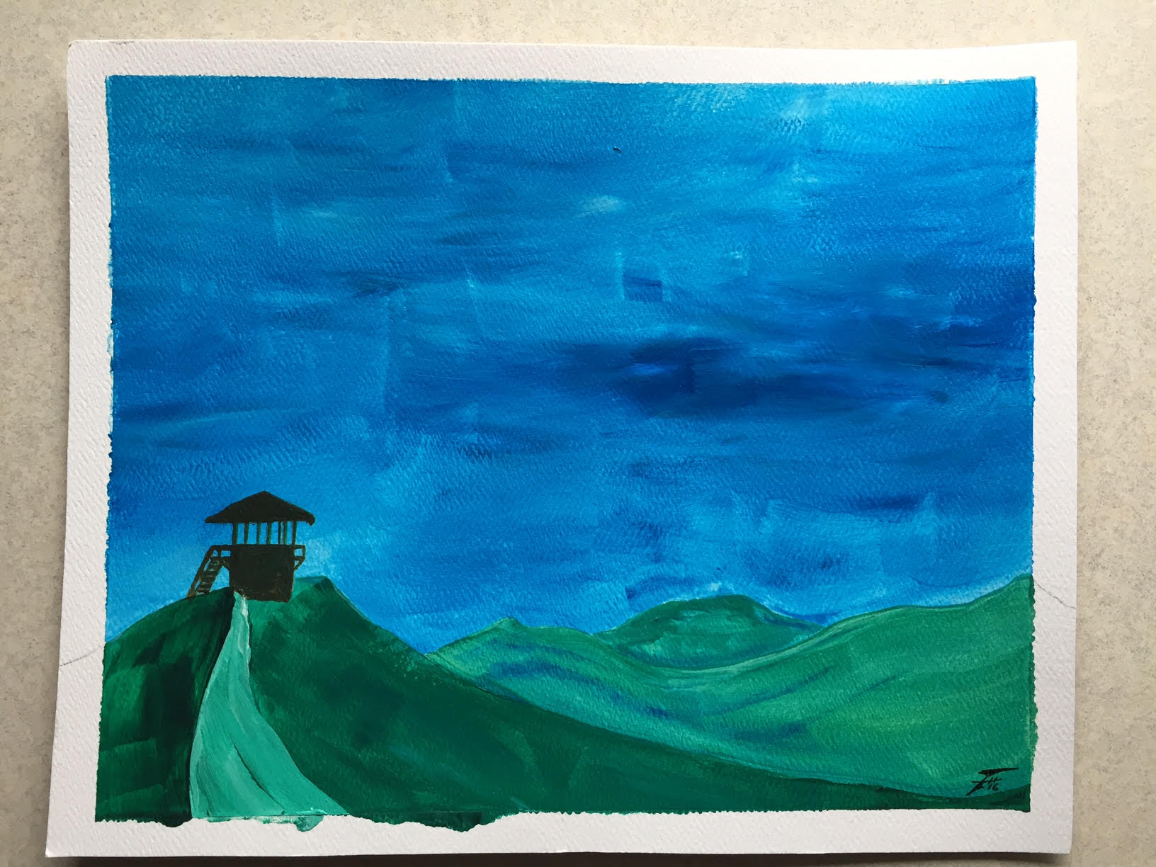
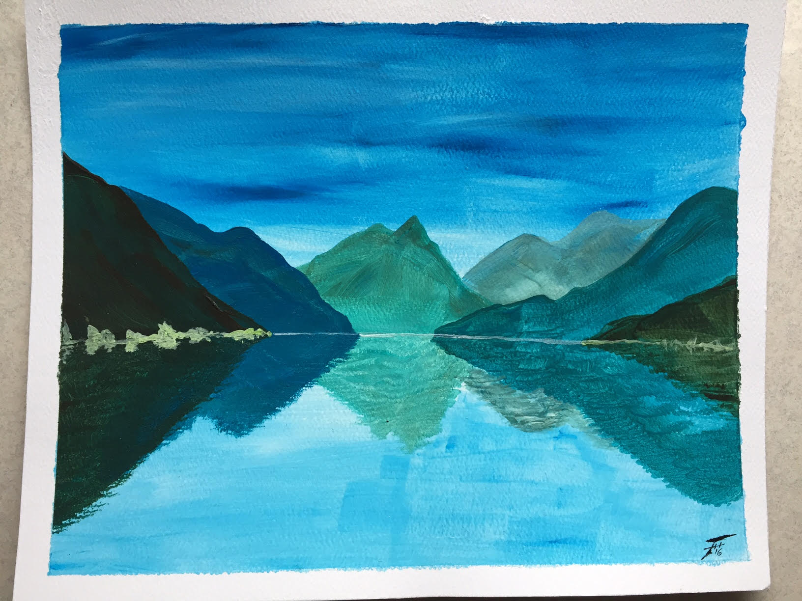
Each of these is painted on 8×10″ cold-rolled watercolor paper with acrylic paints.