Playing with Paint

Most of my time is spent sketching or drawing. I don’t consider myself a painter, but I certainly like the idea! The idea of having the whole world of colors to play with is intoxicating.

Here are a few paintings that I’ve created over the past couple of years. Each of them are painted on 8×10″ cold-rolled watercolor paper with acrylic paints. All but the abstract boxes and landscapes are subjects or concepts that I’ve been repeating (exploring in depth) throughout much of my artistic life.

(Click on the title for more details about each of the paintings/series.)

Each of these is painted on 8×10″ cold-rolled watercolor paper with acrylic paints.

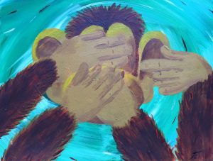
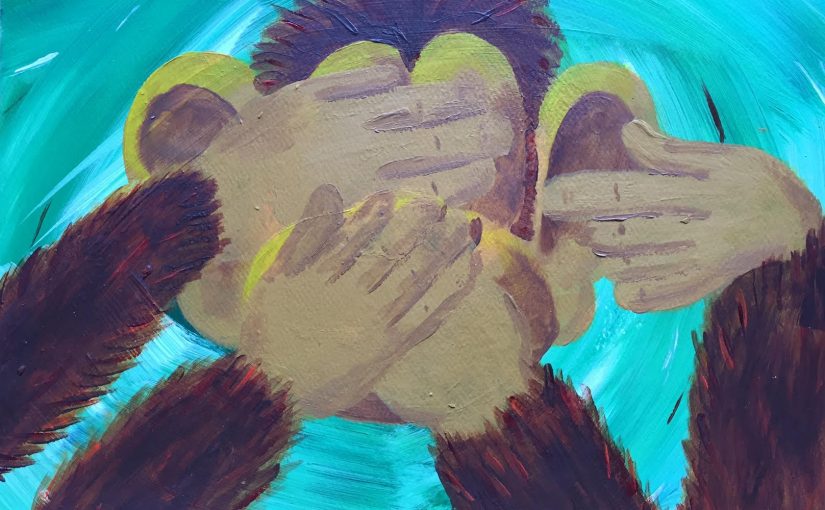
Hear, See, Speak no Evil

While enjoying a cabin in the California mountains, I decided to monkey around with some paints. The Hear/See/Speak concept is a concept that continues to capture my attention (like the triptych featuring Ashley). This was a fun painting to work on and was a good way to ease back into acrylics, since I hadn’t used them in some time prior to this.

The colors don’t look right in the image – it’s an emerald green background and a yellowish-brown fur and face.

Hear, See, Speak no Evil  is painted on 8×10″ cold-rolled watercolor paper with acrylics. It was completed in 2015.

Abstract Boxes

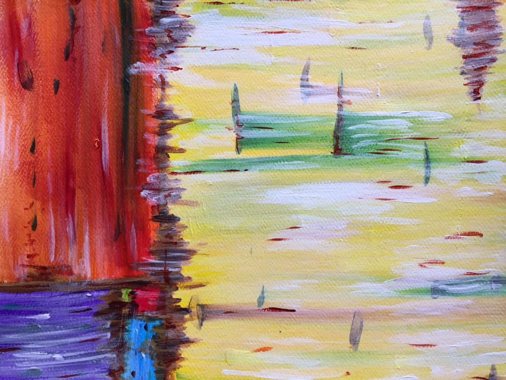
There is some abstract art that really captures my attention, that intrigues me and draws me in. Most of it, however, I just don’t understand. Maybe that’s the analytic side of my brain coming out, or a lack in my artistic education, or… -shrugs- Whatever the reason, I generally prefer representational art, and that is definitely what I make most often.

In an attempt to further my understanding, sometimes I try my hand(s) at making abstract work. Abstract Boxes is such a piece, playing with the golden ratio and a variety of colors.

It is painted on 8×10″ cold-rolled watercolor paper with acrylics.

Flying Birds

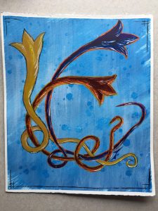
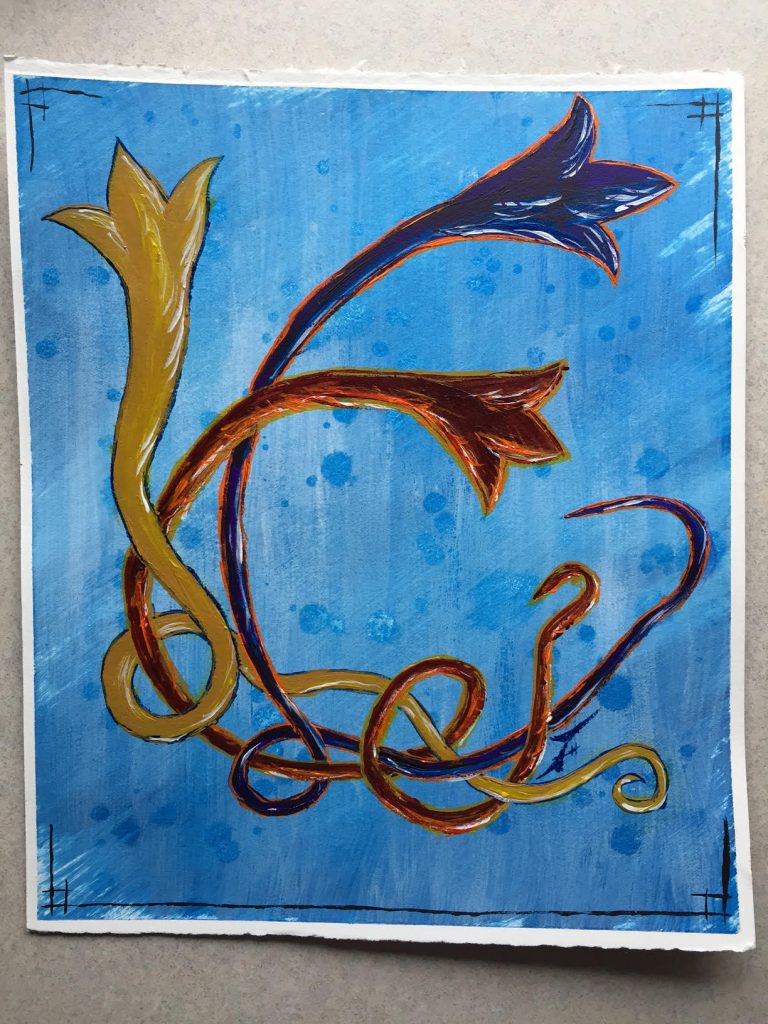
This is yet another of the recurring images that I draw, a series of (generally 3) stylized birds flying up from the left. Their tails, like ghosts, Chinese dragons, or visual after-images, show the paths they’ve traveled to arrive.

For a long time I’ve thought that this might make an interesting letterhead, or a water-marked set of stationery, though I haven’t pursued that concept yet.

Flying birds in color, with an experimental background and a version of my usual corner-framing. It’s painted on 8×10″ cold-rolled watercolor paper with acrylics.

Simple Landscapes

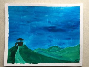
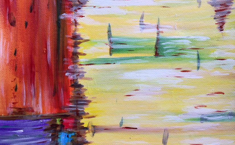
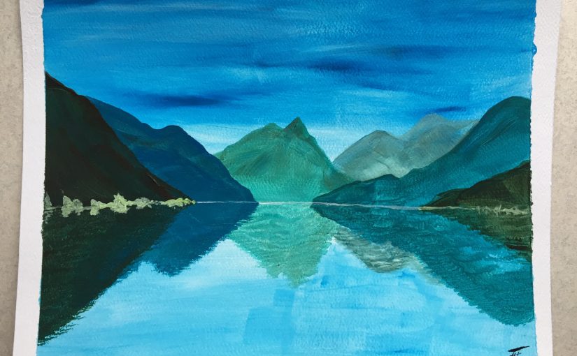
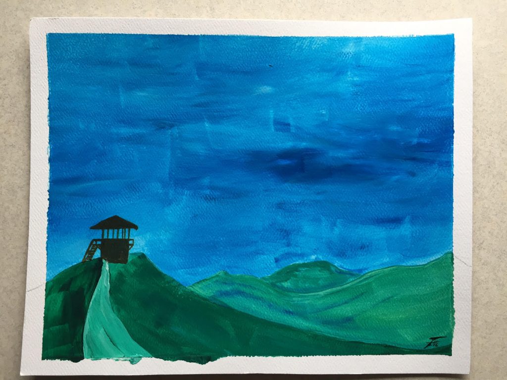
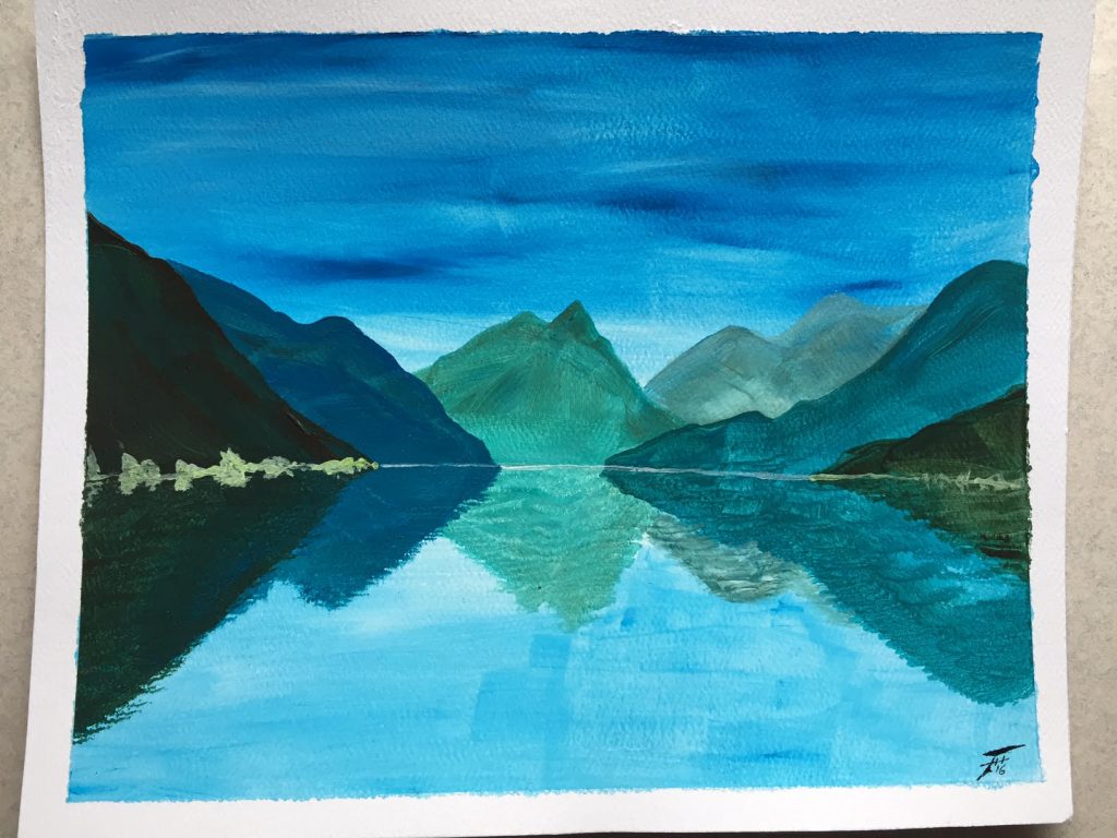
While working on the cityscapes and sunset trees I also wanted to experiment with some simple landscapes. Though I might sketch some scenery while out and about, I definitely don’t paint them very often. It was fun to quickly create these two pieces, especially since they represent real places in Washington that I have fond memories of.

This is the watchtower on Mount Freemont in Mount Rainier National Park. Ashley and I hiked out there with Jackie and Mikel. This view was photographed in the rare few clear moments when we could see. It’s not a detailed “accurate” depiction of the scene, which I had to consciously be ok with. I can tend to focus on the details and struggle to achieve a loose, flowing style.Using the same basic palette I also tried to capture the feeling of our time spent at Lake Crescent. On one of our visits we stopped for an early morning coffee break to enjoy the view and lucked into perfectly still water. The mirrored mountains only magnified the beauty of the location.

Each of these is painted on 8×10″ cold-rolled watercolor paper with acrylic paints.

Sunset Trees

I suppose they could be Sunrise Trees, if you prefer that time of day!

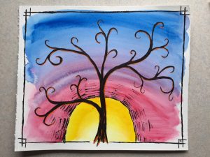
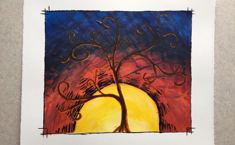
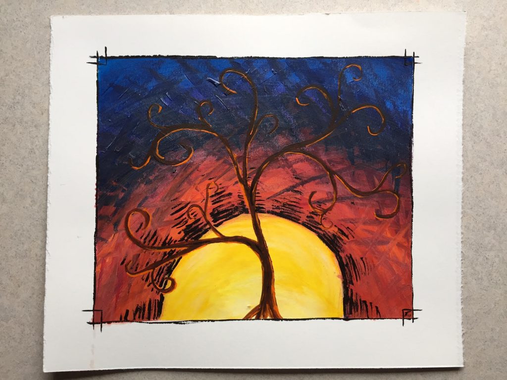
Another of the subjects that I draw regularly are trees, specifically in front of sunset. Here are a few paintings in that vein from a bit of colorful playtime.

The first two combine a few recurring subjects – the borders (specifically the corners), the trees in front of the sun, and that specific way of drawing a sun with the lined “rays” radiating out from them. Of course, I normally do all of these things in a drawing – so this is the colored version of that concept. Additionally, the rounded branches was a new style that I was playing with.

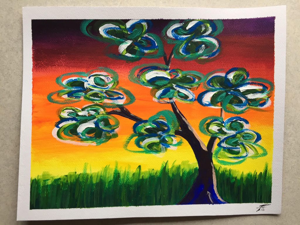
In the above I was playing with texture, using angular hatched lines to fill in the background. And while both of these are acrylic paintings, below I was experimenting with the medium, pursuing a looser, more watercolor-like feel. Along with that looseness I also varied the borders – not sure which I like more, but the varying widths certainly give drastically different feelings to the paintings!Finally, this unique tree was painted at the same time as the orange-skied cityscape and was yet another experiment. I find the delicate, bare branches of trees beautiful and fascinating as they are silhouetted by the sky – and that’s generally how I portray them. Adding leaves is relatively rare, and these stylized, swirls of foliage was an experiment in color and style.

Each of these is painted on 8×10″ cold-rolled watercolor paper with acrylic paints.

Cityscapes

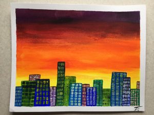
There are a few subjects or themes that I find myself returning to over and over. When I’m bored and supposed to be listening I doodle box stacks or swirls. Nothing coming to mind? I’ll make sunset-silhouetted trees. Have a bit of color or a blank paper coffee cup? Cityscapes it is!

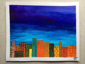
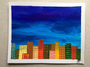
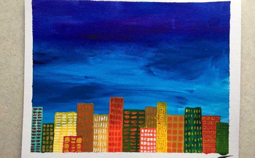
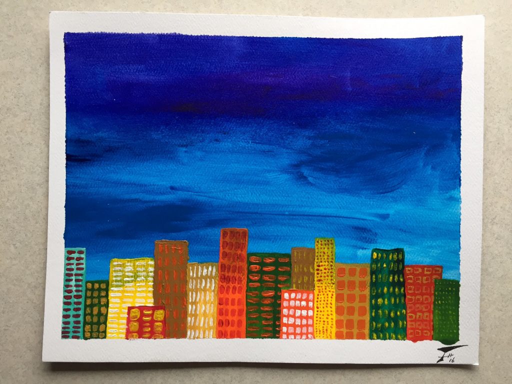
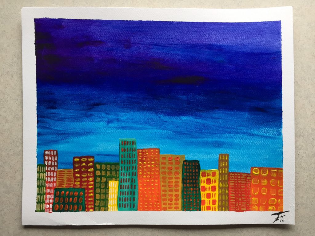
I’ve thought about spending a bit of focus drawing real cityscapes that I’ve encountered. Until then, however, here are a few playful paintings, done where I was primarily just having fun with my paint supplies. I do love the contrasting colors and different size/shapes of the buildings and windows!

These two blue-skies were painted simultaneously, side-by-side. So they could function as a diptych (a two-part painting) or equally well as individual works.

Each of these is painted on 8×10″ cold-rolled watercolor paper with acrylic paints.

Playing with a (new) Marker

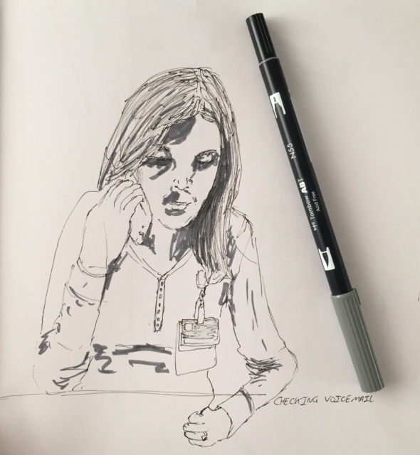
Yesterday we went downtown and walked about to see what we could see. Ran across a nice little bookstore/art gallery and also a paper store. I picked up a gray Tombow dual brush pen/marker. I’ve been curious about these for a few months now and finally saw one in a store. This should allow me to quickly add a bit of shading to my sketches while not adding much bulk to my carry-around items.

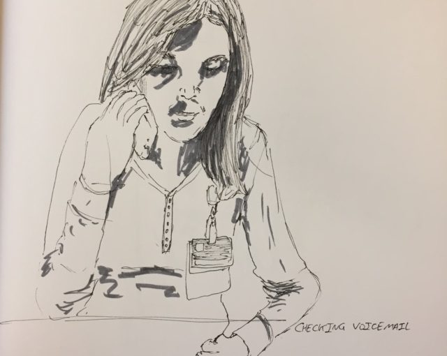
After walking in the park, we headed to the hospital because Ashley had a quick training session. We arrived early and sat in the cafeteria until they closed it for cleaning. Upon arriving, Ashley realized she had a voicemail and listened to it, while I sketched her.

I’ve realized that I just sketch when I have time – and that drawing expands to fill the amount of time available. So I have no idea how long each of these sketches take! So yesterday I tried to pay a little more attention. This quick portrait was roughly 5 minutes.
Ashley headed up for her class, so I drew another view of the cafeteria.
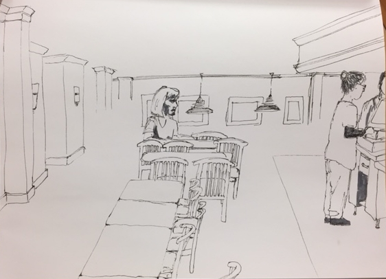
Have to say, I’m getting a bit tired of drawing those chairs… But they’re so prominent it’s hard to omit them! After finishing the sketch I added some shading with my new marker. Here you can see a bit of the contrast of the before/after. Really adds some visual interest!
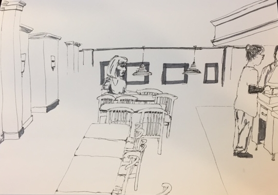
Ashley actually recalled the time incorrectly (we were thirty minutes early), so she came back down and joined me. That means that the above sketch took roughly 20 minutes.

They close the cafeteria a few times each day for cleaning/restocking/etc. This was one of those times, so we headed out to the lobby. Ashley headed back upstairs for the meeting shortly after we arrived, so I spent about 30 minutes sketching the StarBucks kiosk, along with some of its patrons.
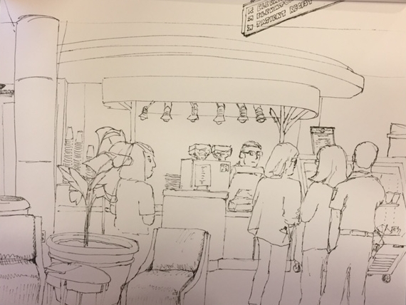
While sketching I had one woman stop by and ask if she could be nosy and see what I was drawing. She really liked seeing this and the other cafeteria views, and was impressed with Emily’s portrait. I had just started adding some shading when Ashley arrived and we headed on our way.
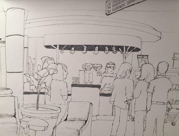
I’m loving my marker! It’s nice to have the option to quickly add some shading. I’ve been carrying around a little travel watercolor set but haven’t broken it out yet – it’s both a bit time consuming and quite intimidating to add color. But with the success of this new marker, I think that color is the next step!
Hanging out in the Cafeteria

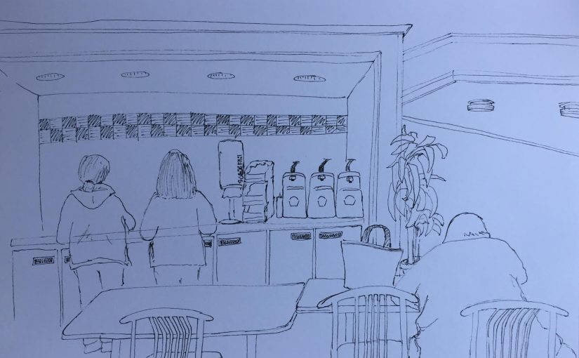
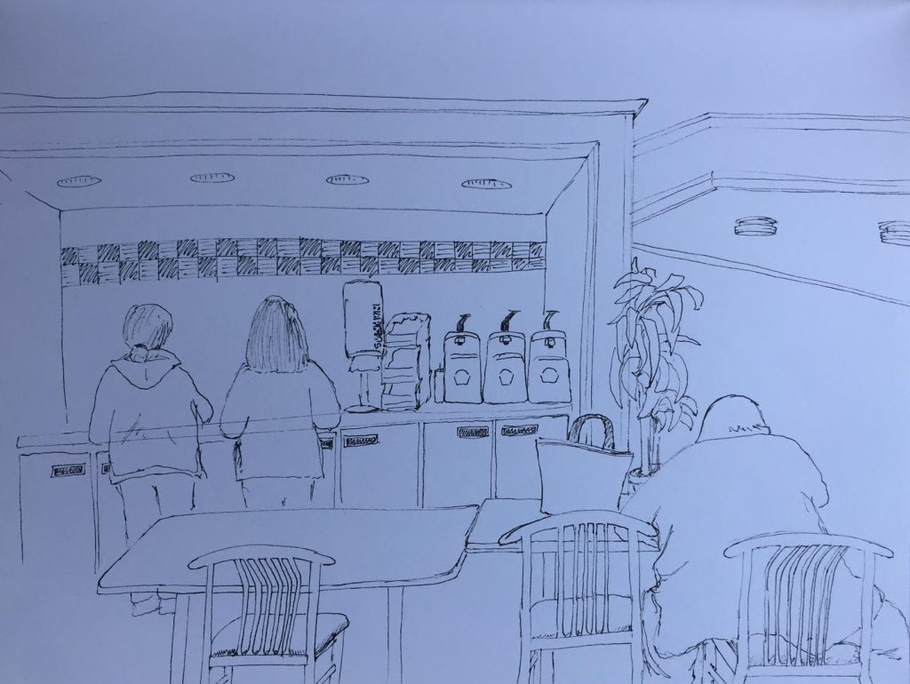
Spent some more time in the hospital cafeteria, waiting for Ashley to escape from work. Over two visits I sketched the view in front of me, trying for a bit of a different angle than before.

During the first wait, I sketched the right table and the woman grabbing a bite to eat, the frame around the condiments counter and the ceiling fixtures.

The second visit saw the addition of the counter itself, the items on top of it, the two ladies in front, the left table and chair and the decorative tree.

Already having something started certainly makes it easier to sit down and just get to work. Especially when it doesn’t matter if there are people in sight or not!
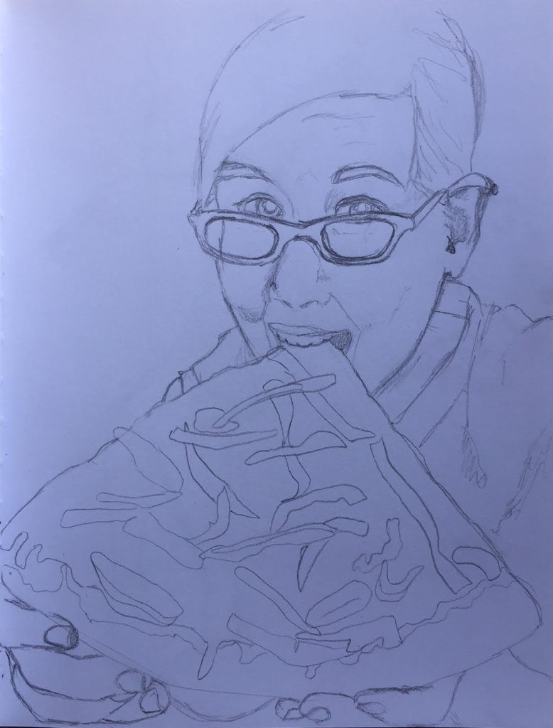
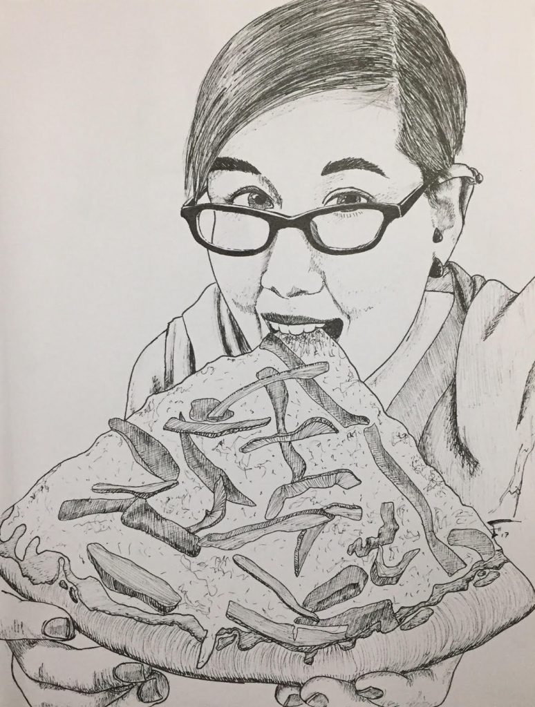
Pizza the Size of Her Head!

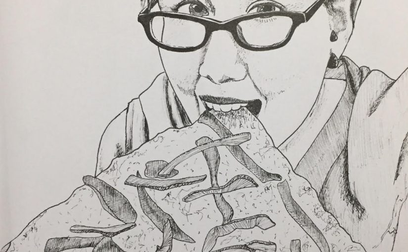
Checking in on friends on facebook, I ran across this picture of Emily. Thought it was fun and decided to draw it. Emily, hope you enjoy! 😀


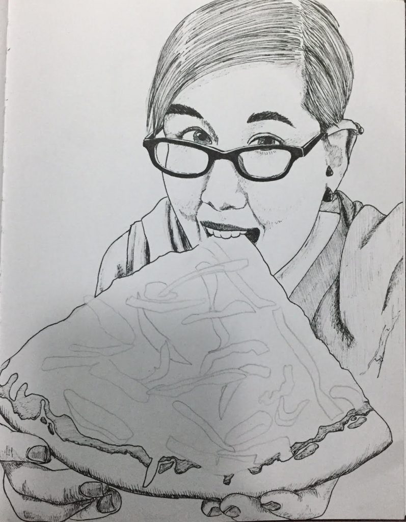
And here are a couple of in-progress pictures:

First, the sketch in pencil, to help me get proportions correct before laying down ink.

The drawing in-progress – Still have to draw the pizza toppings (mostly different pepper slices) and add some depth to her hair.